About the Brand
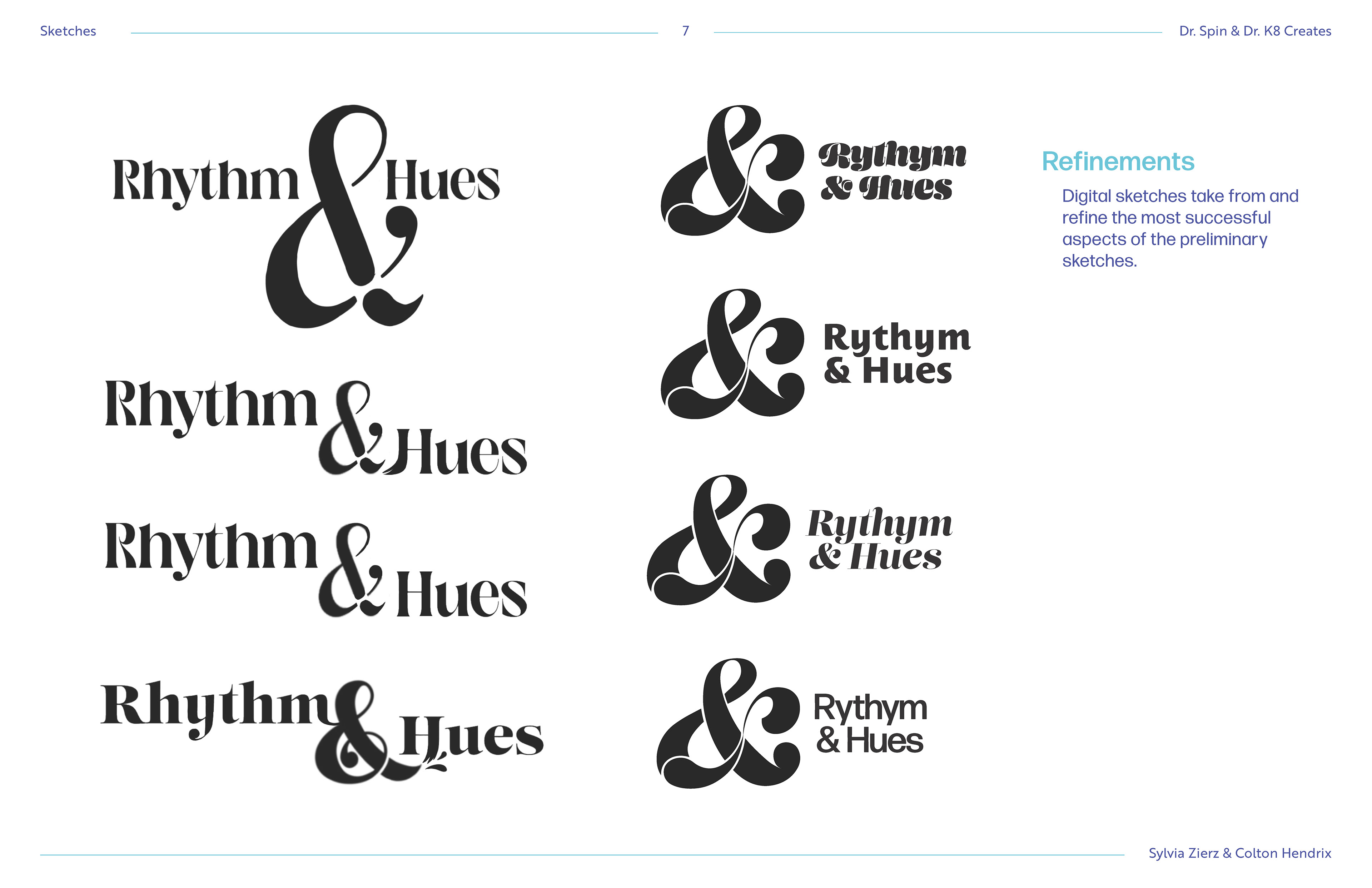
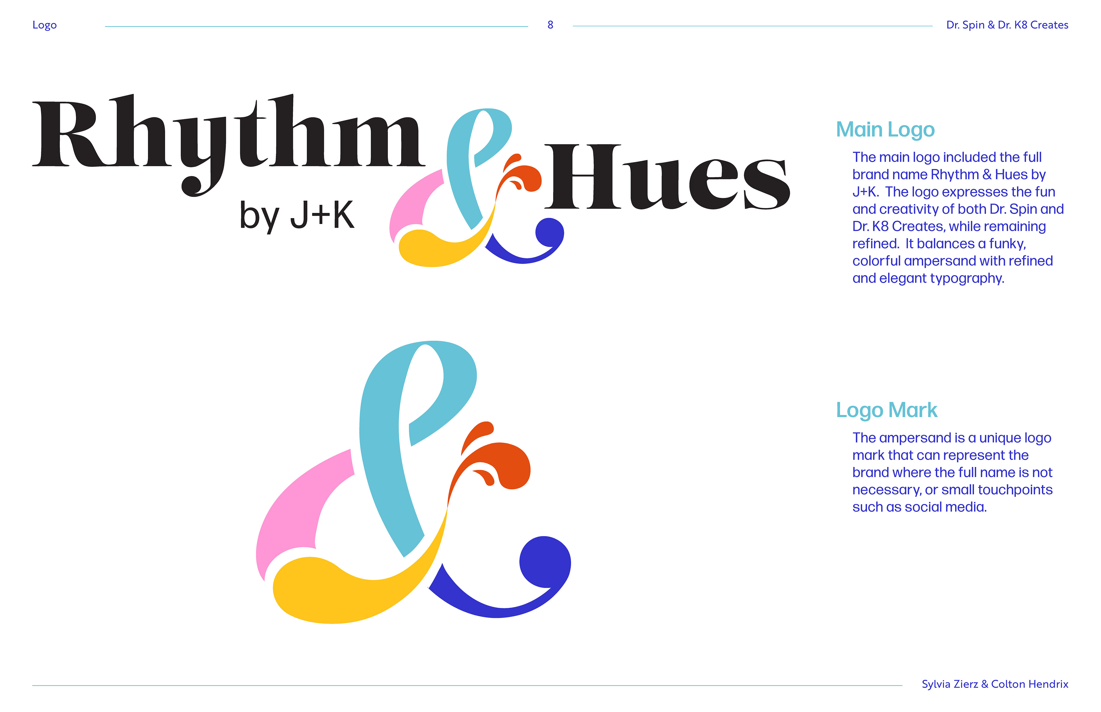
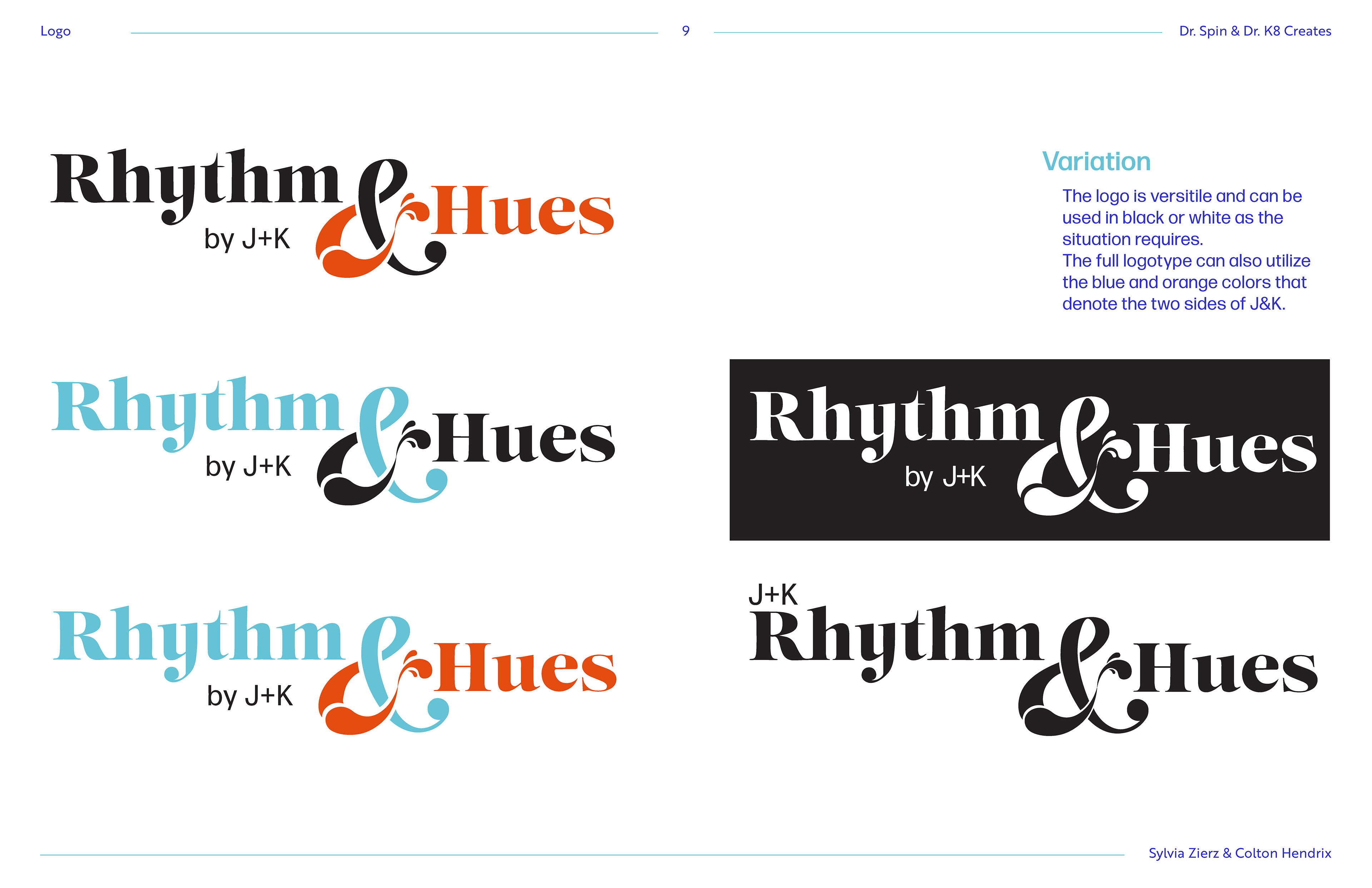
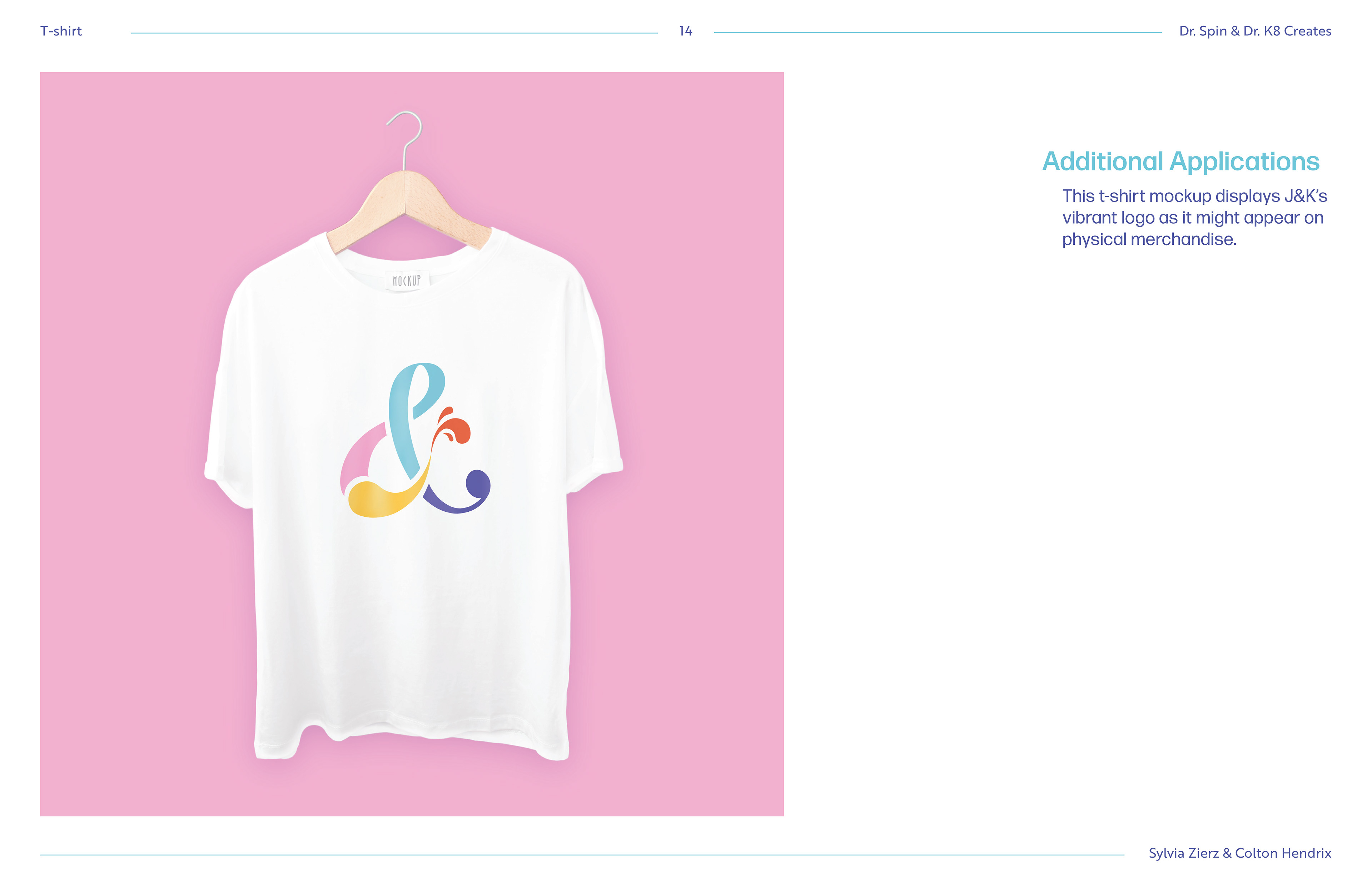
Rhythm and Hues is about connection and harmony between two main ideas. The brand is flexible, yet consistent. The brand is colorful and playful, yet modern and sleek. Each part of the brand can be connected in any way see fit and still work together as a cohesive identity. The logo itself portrays these ideas, winding together while being modular and colorful. It can be used in a variety of ways yet has a unique style and identity, just like the brand itself. The intertwining shapes show the two ideas and how they interact. The separate shapes shows the modularity of the brand, while still having personality. Finally, the paintbrush and music note show off the separate identities contained within the brand, connecting the two but showing off the differences as well.
The Assets
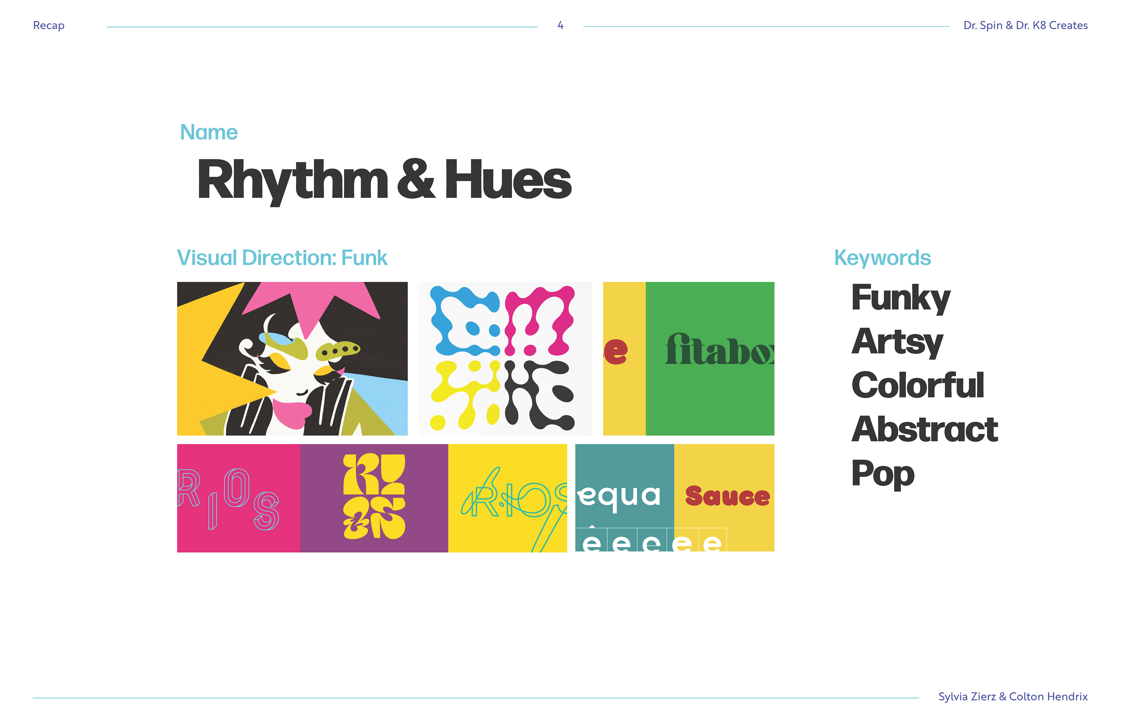
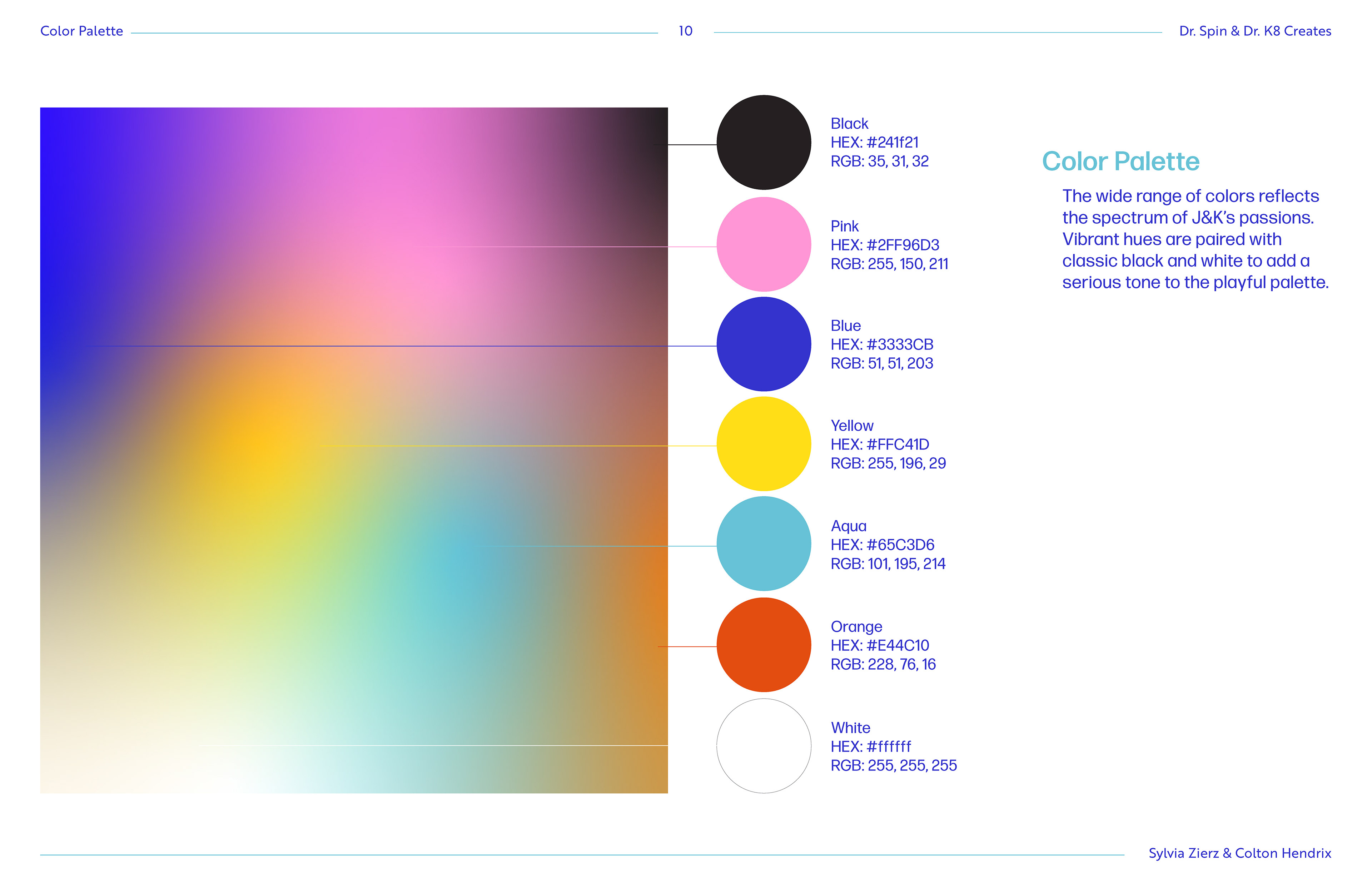
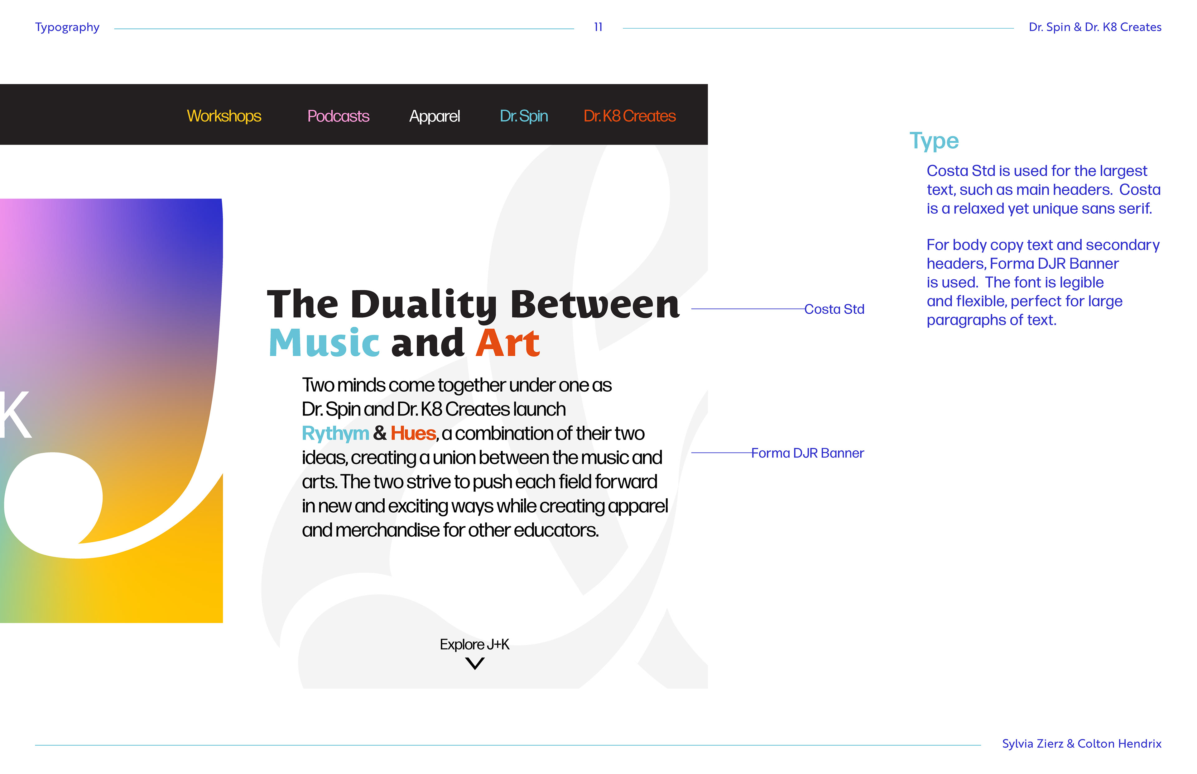
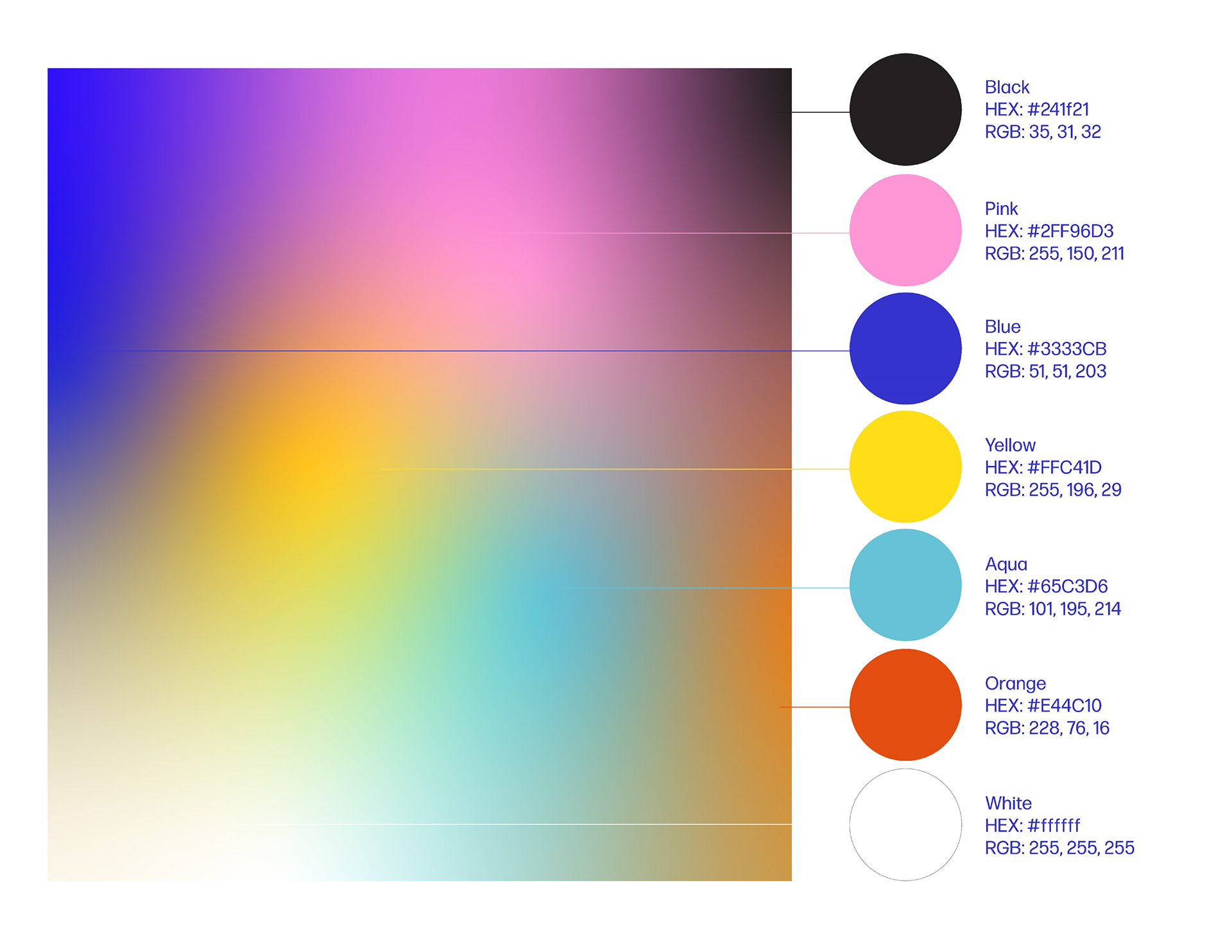
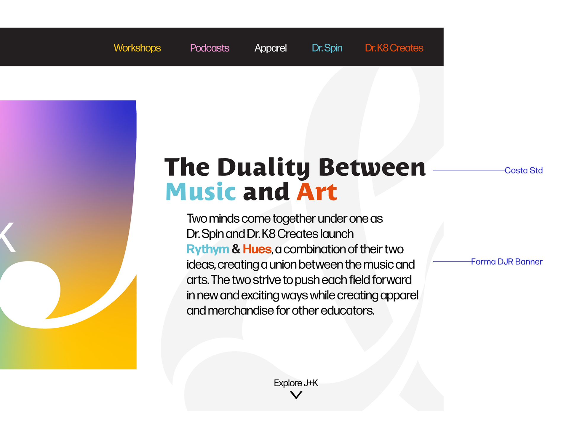
The color palette is very colorful, showcasing the fun vibes of the brand, however the two primary colors are black and white. With these bright colors leading to support the main two, the brand can maintain the clean and flexible look but still have plenty of room for personality and fun. The typography was based on the same idea. With the clean look of the text supporting this minimalist yet poppy style, it also has flares of personality within both the main and secondary fonts, allowing the brand to not feel so cold and lifeless but feel unique but assessable.
Final Branding Guidelines
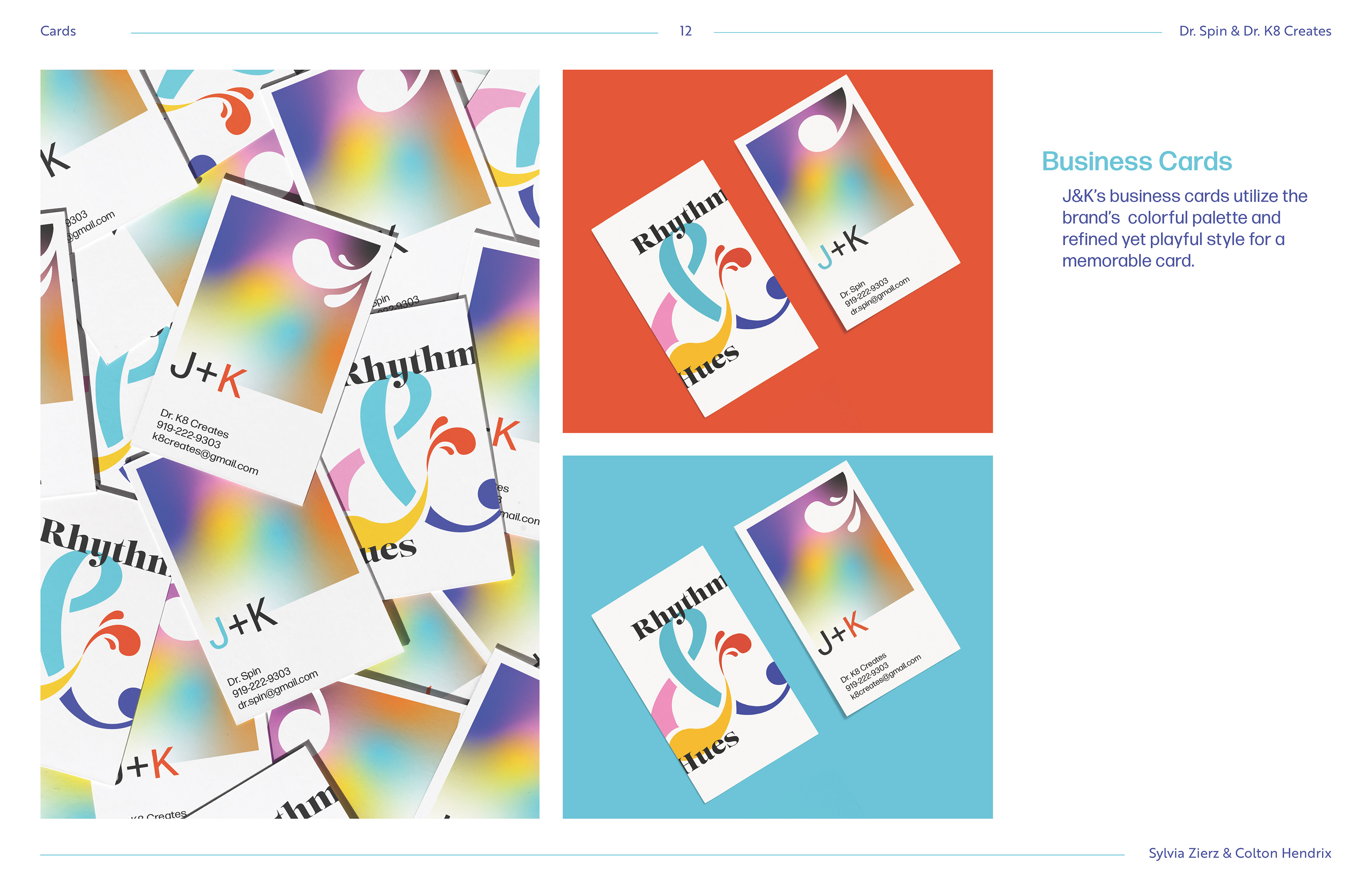
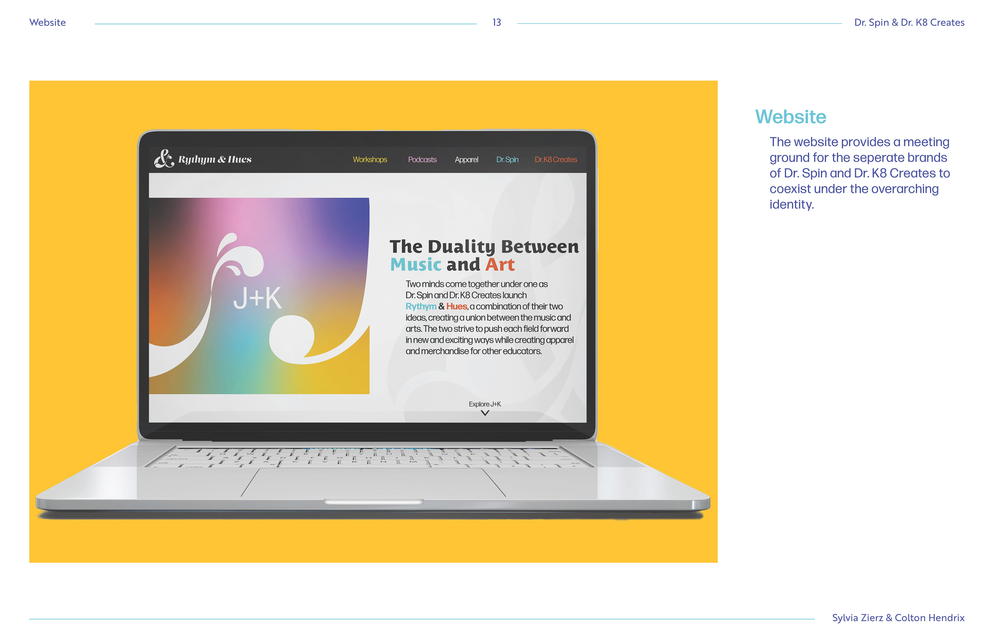
Main Deliverables: Brand Guidelines, Logo, Color Palette, Typography, Business Cards, Mock-Ups
Presented to the client were the final brand guidelines of the brand, showcasing how it is meant to be used but also the flexibility and unique individual assets of the brand.
