About the Brand
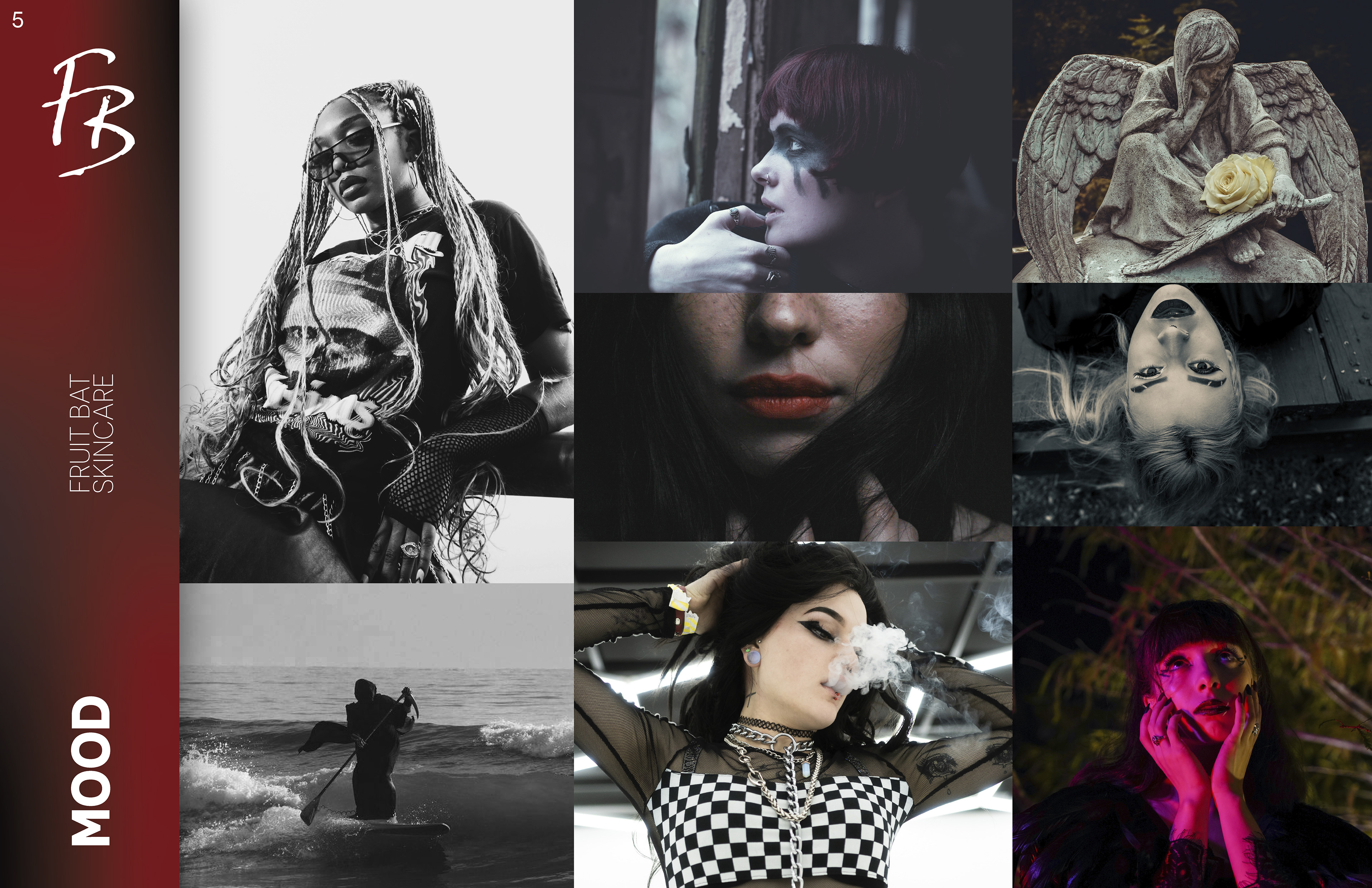
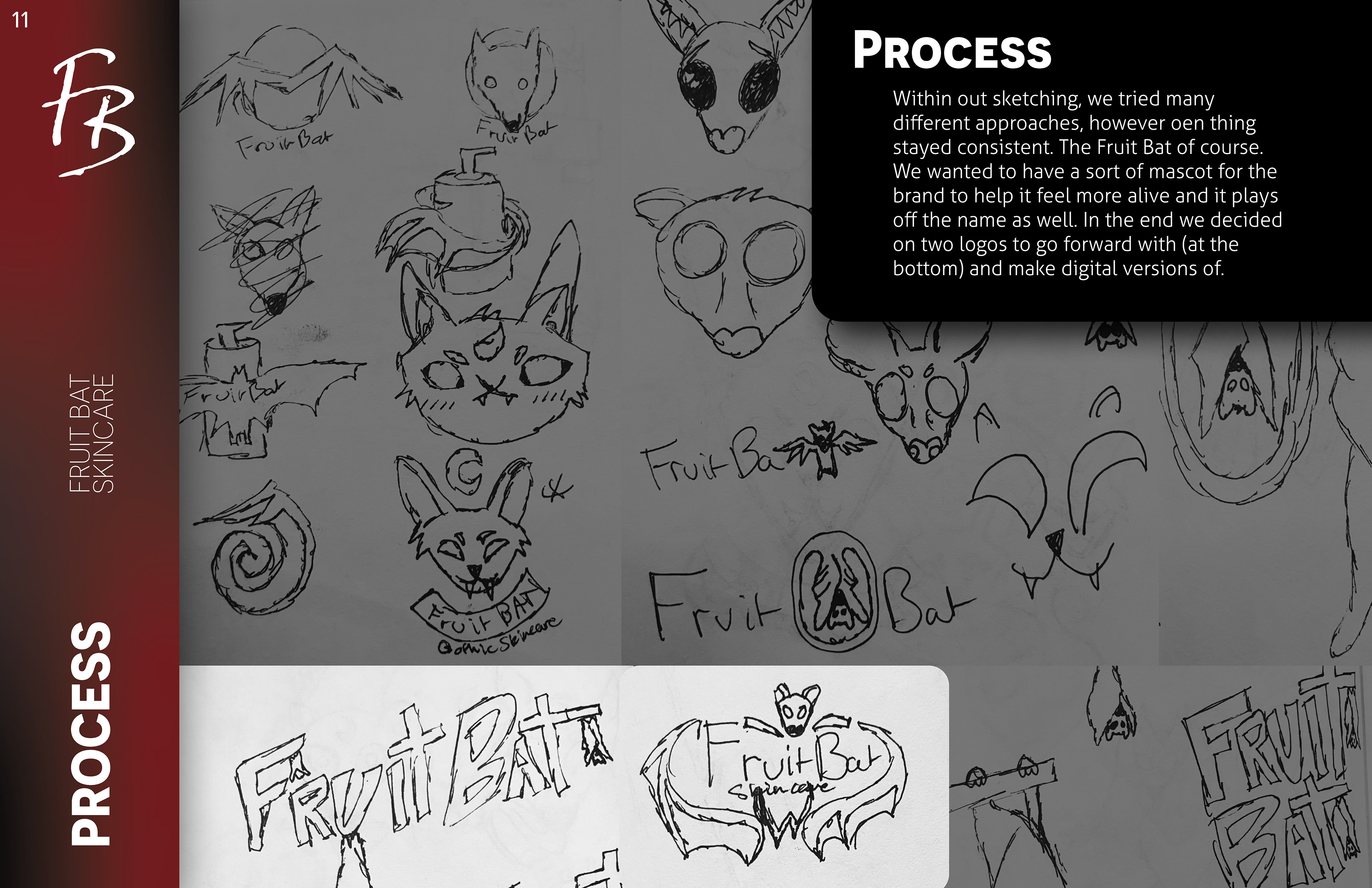
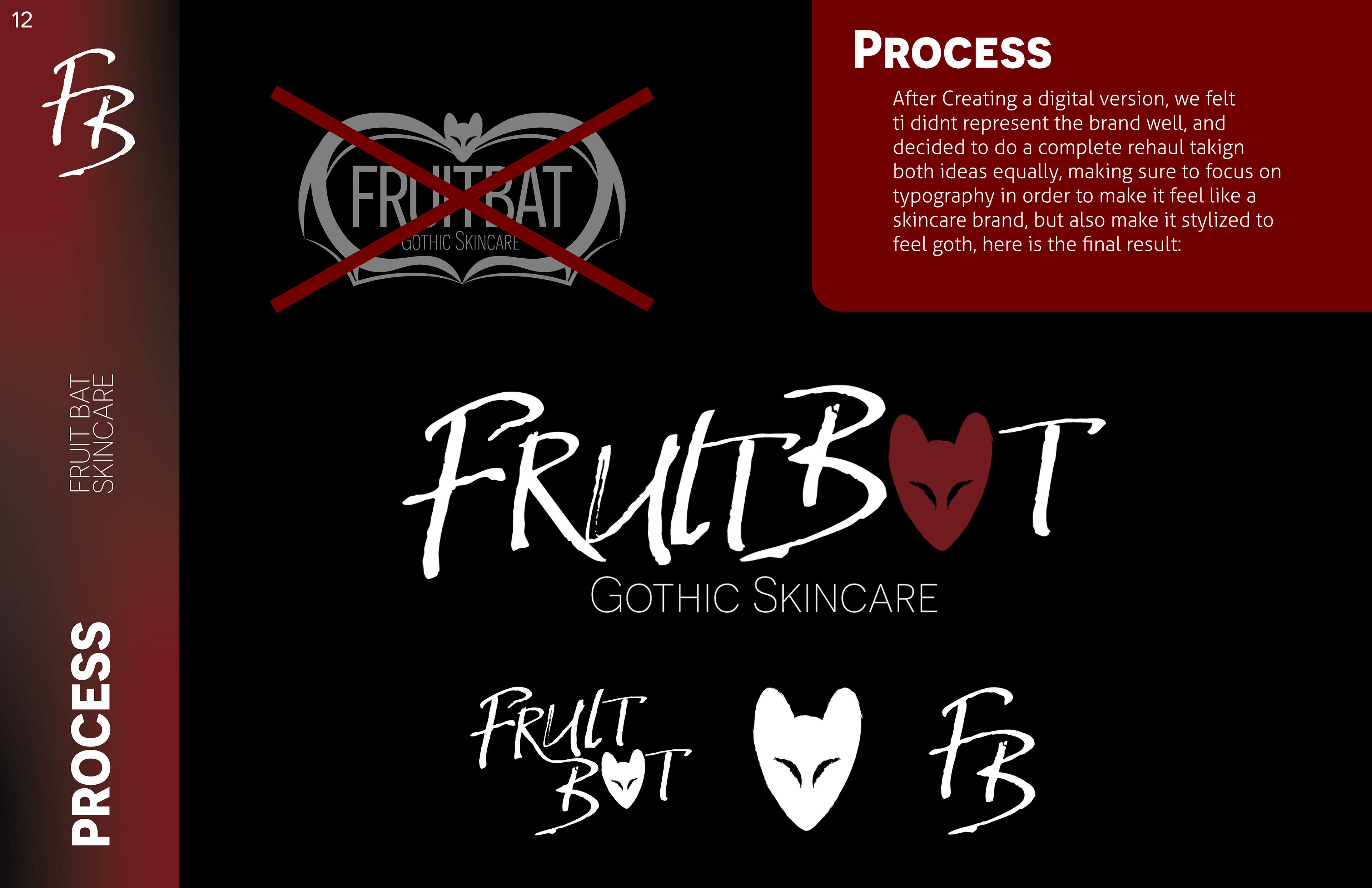
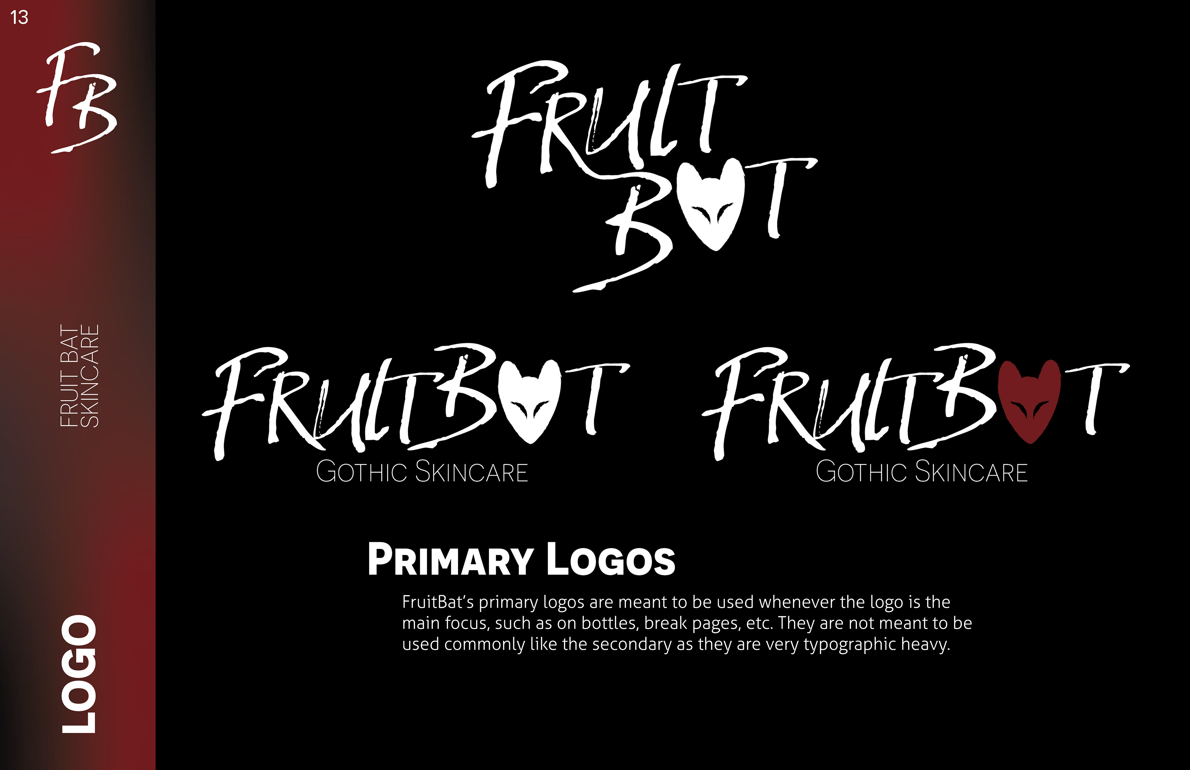
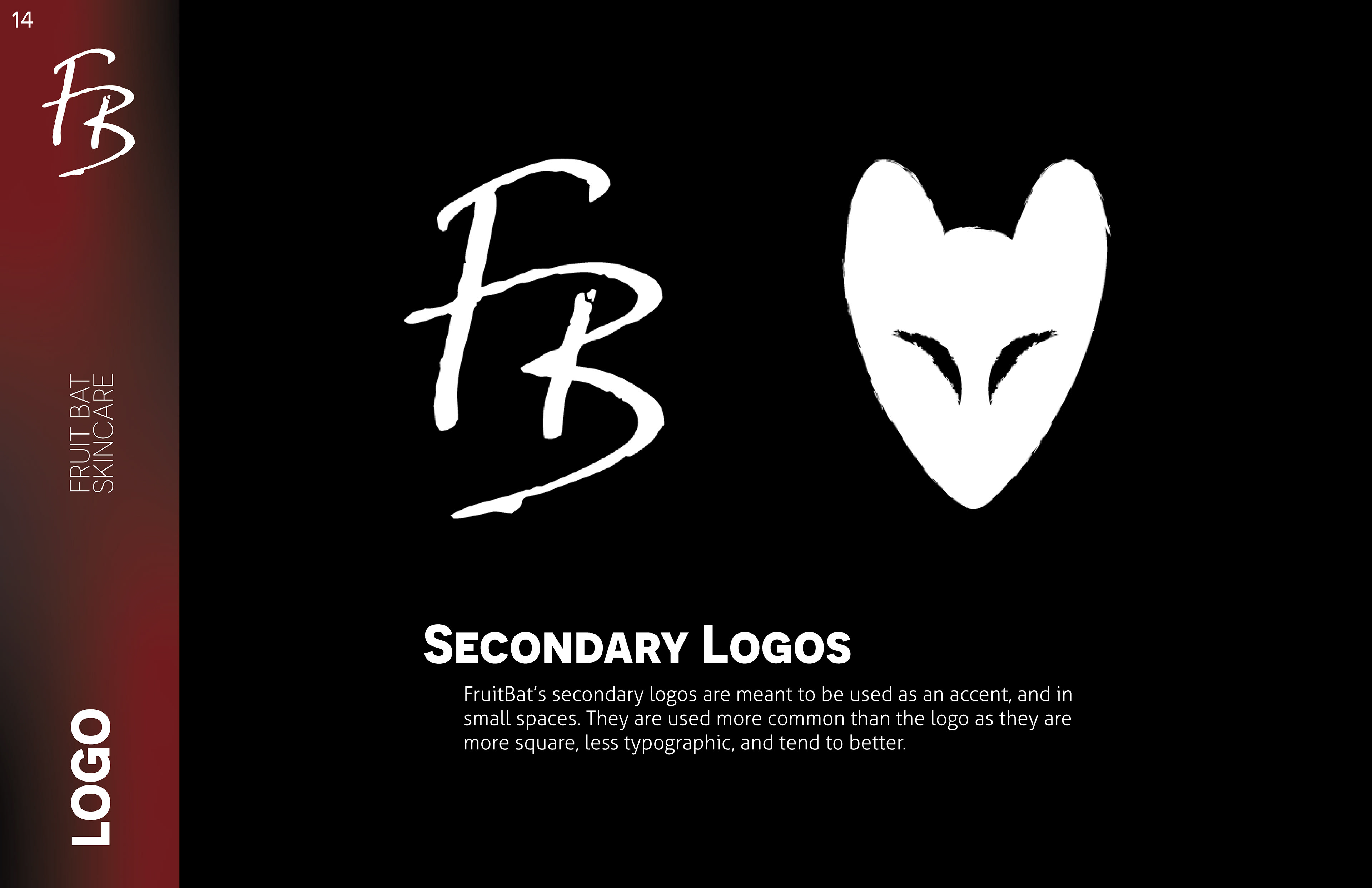
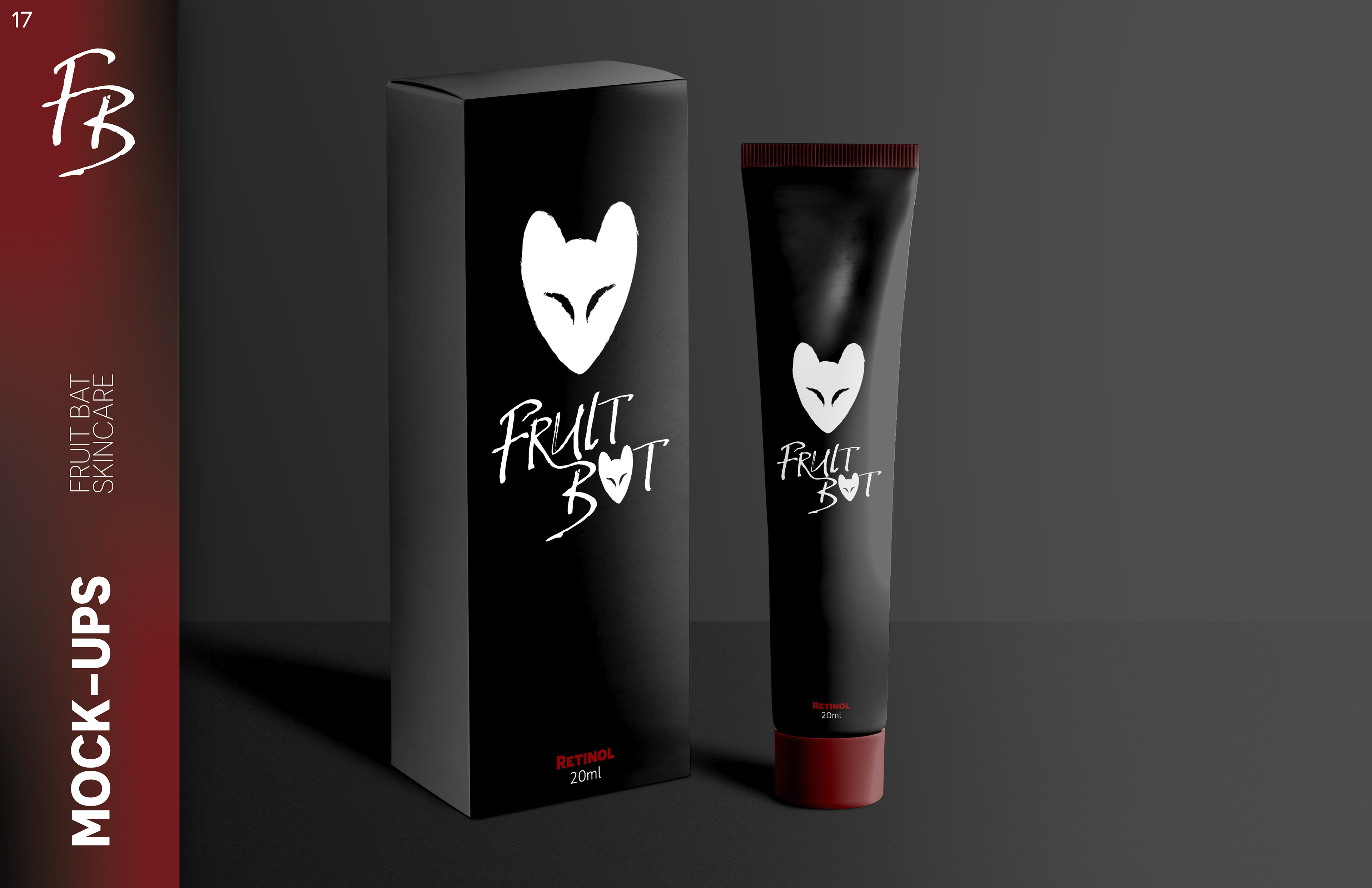
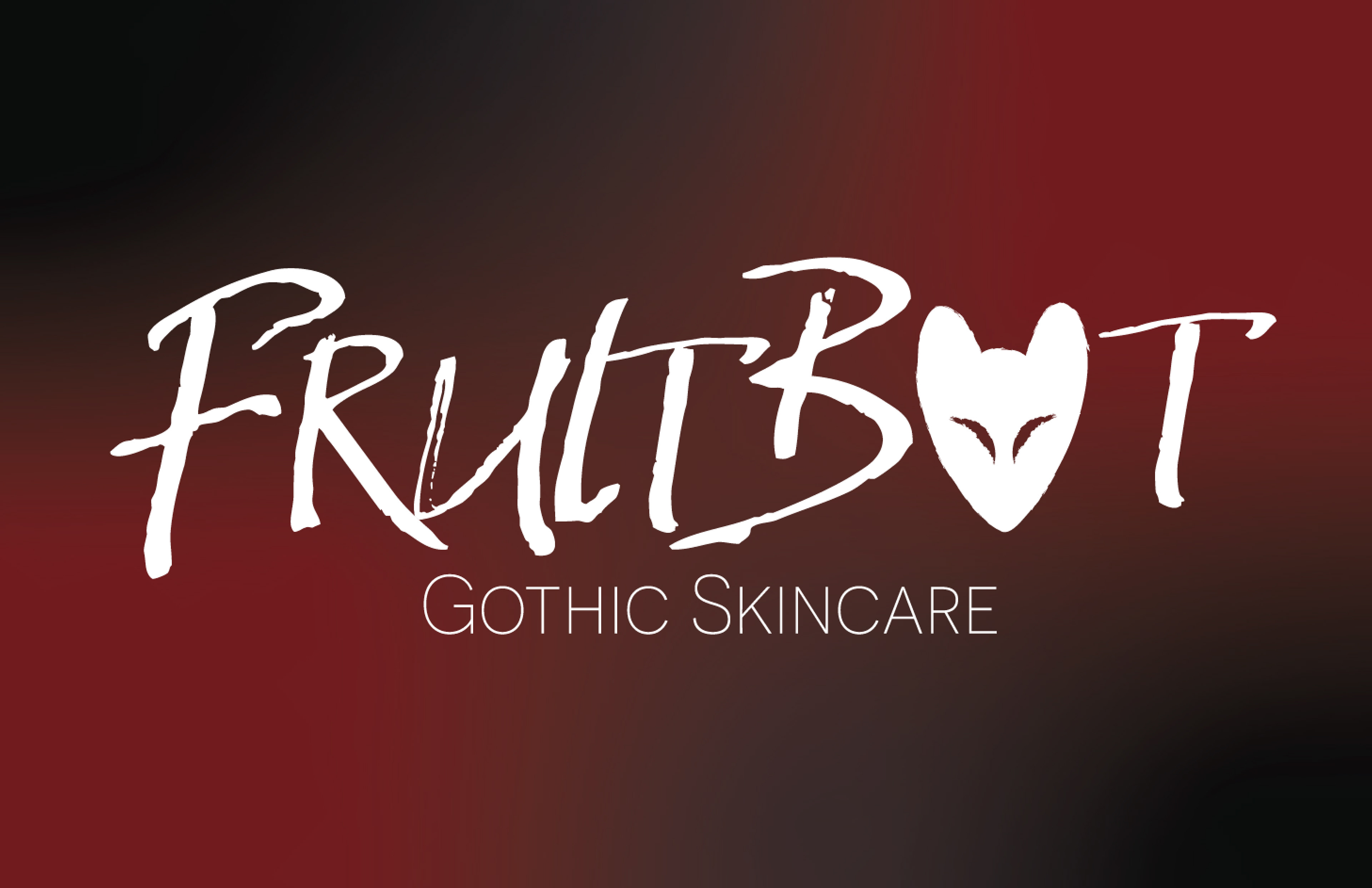
When coming up with an identity for the brand, multiple directions were proposed, however the main one chosen was this 'modern goth' style, with brands such as hot topic, rip n' dip, and other modern emo brands. We wanted the brand to be bold and fun, yet still be focused around it actually working. When brainstorming names, we came up with FruitBat, because in essence, that's what we wanted the brand to feel like. This also allowed for a mascot type character that can be used as a stamp, in the logo, and just as decoration. Incorporating this into a typography style logo gives it the feel of a skincare brand but also the fun style of modern goth.
The Assets
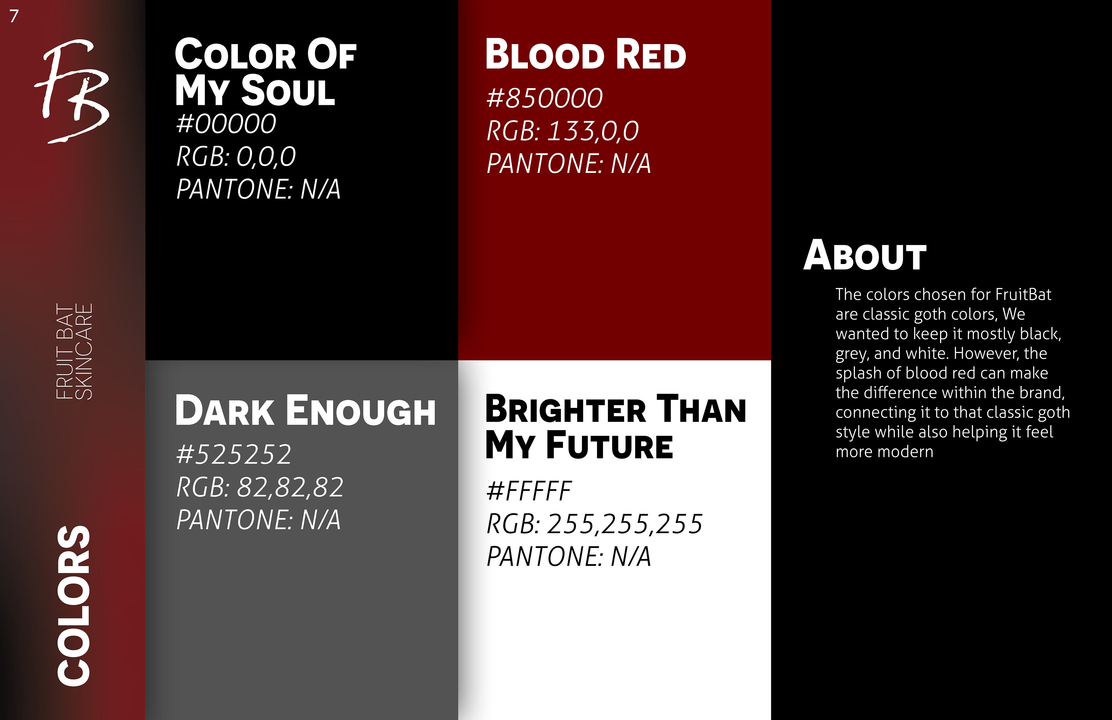
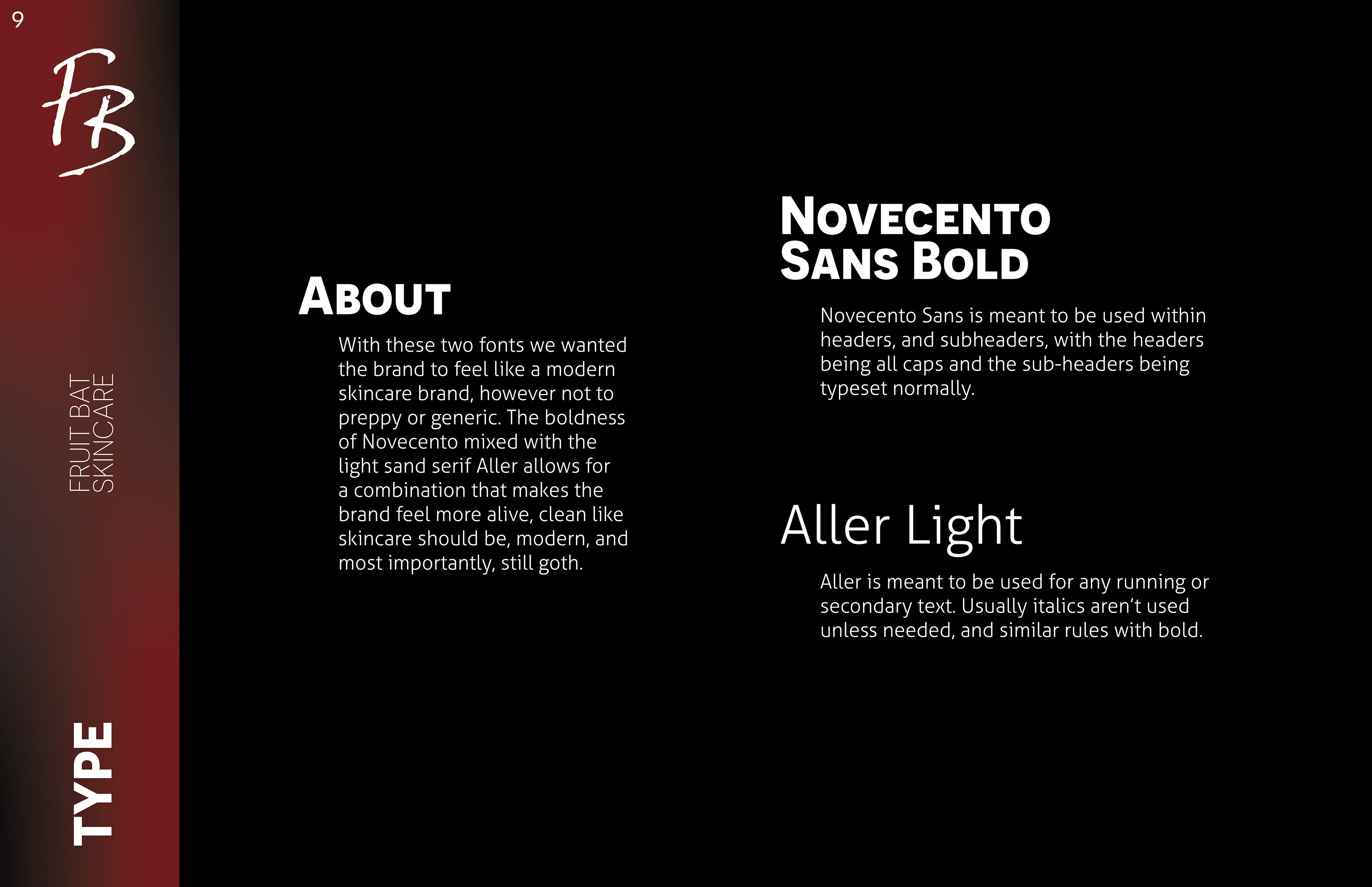
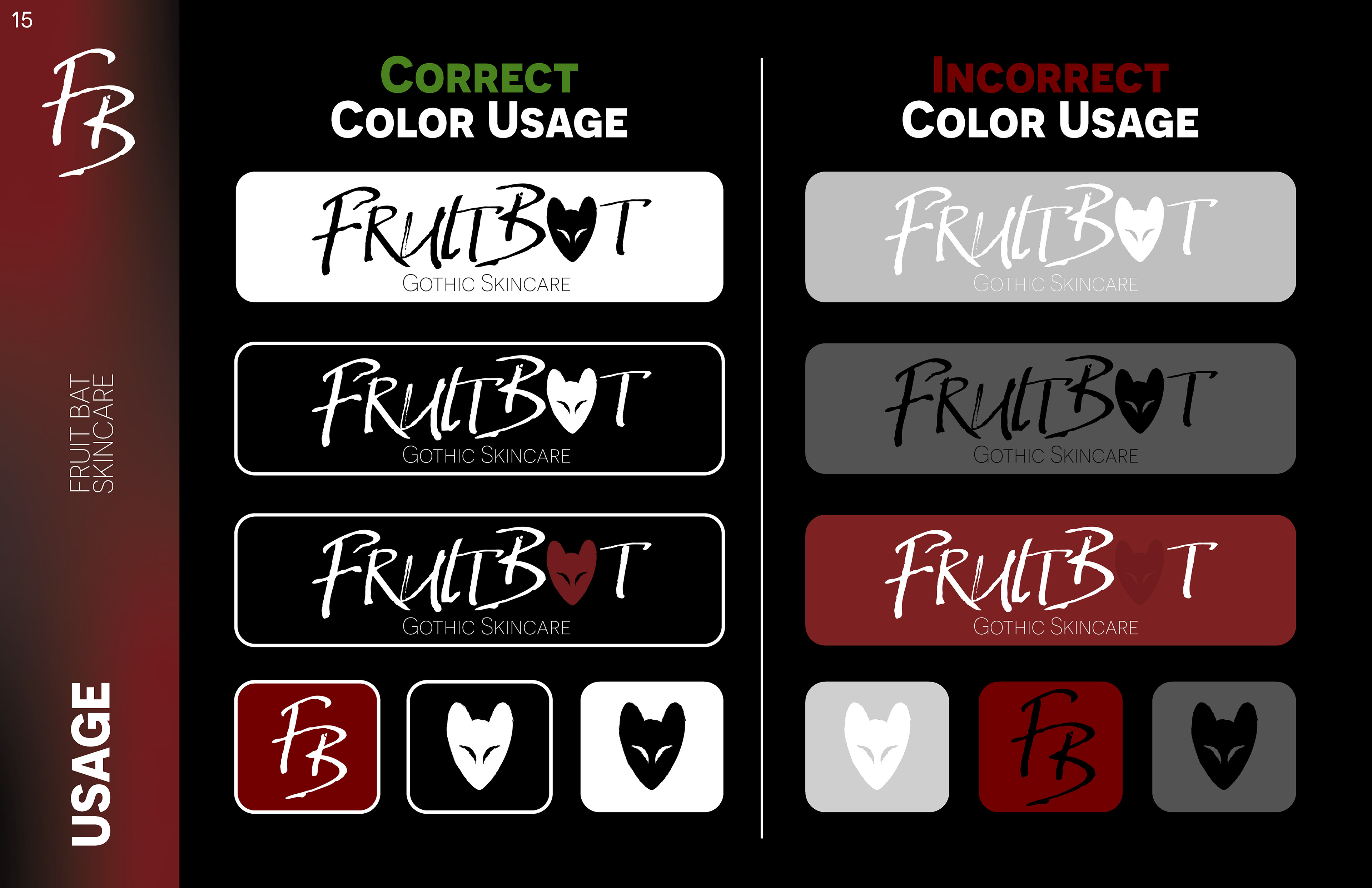
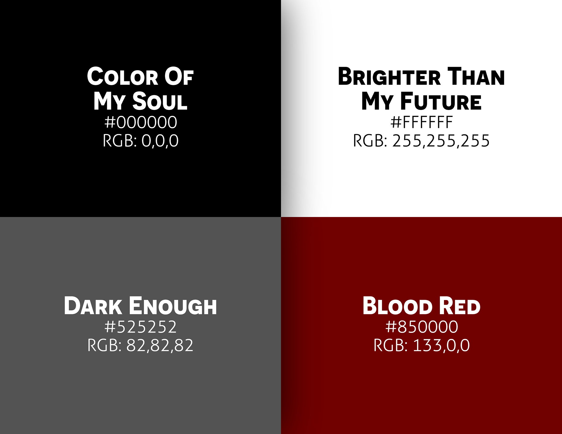
When brainstorming colors, the obvious choice was black, with some white. However we wanted a bit more variety and the main secondary color became red, inspired by many goth subcultures and of course, horror. Red, mixed with the other shades, allowed for a simplistic color palette that popped and would be bold and noticeable. The gradient was created using these colors so the brand didn't feel so flat. The typography was chosen as a compliment to these bold colors while not feeling too cold or generic. the two fonts work together seamlessly and allow for flexibility and pop to the brand.
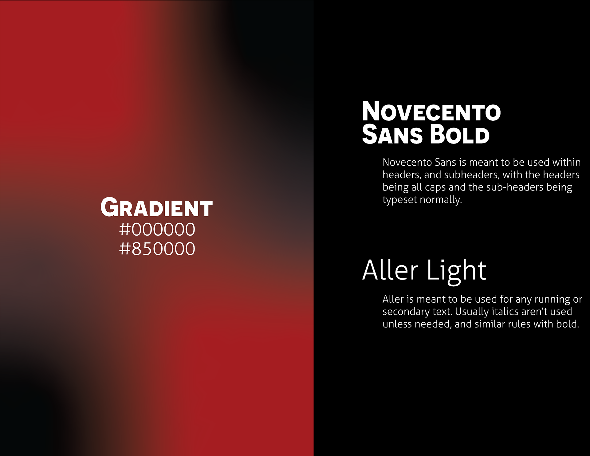
Final Branding Guidelines
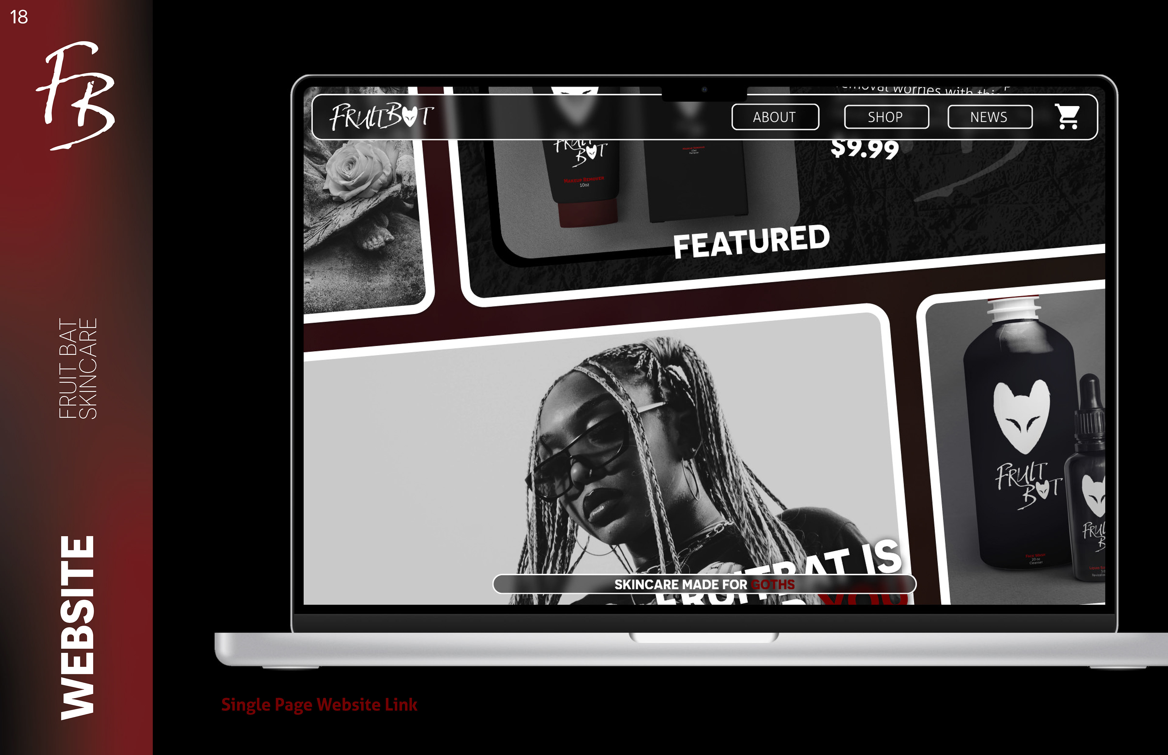
Main Deliverables: Brand Guidelines, Logo, Color Palette, Typography, Website (1-Page), Mock-Ups
Presented to the client were the final brand guidelines of the brand, showcasing how it is meant to be used and each deliverable within the brand.
