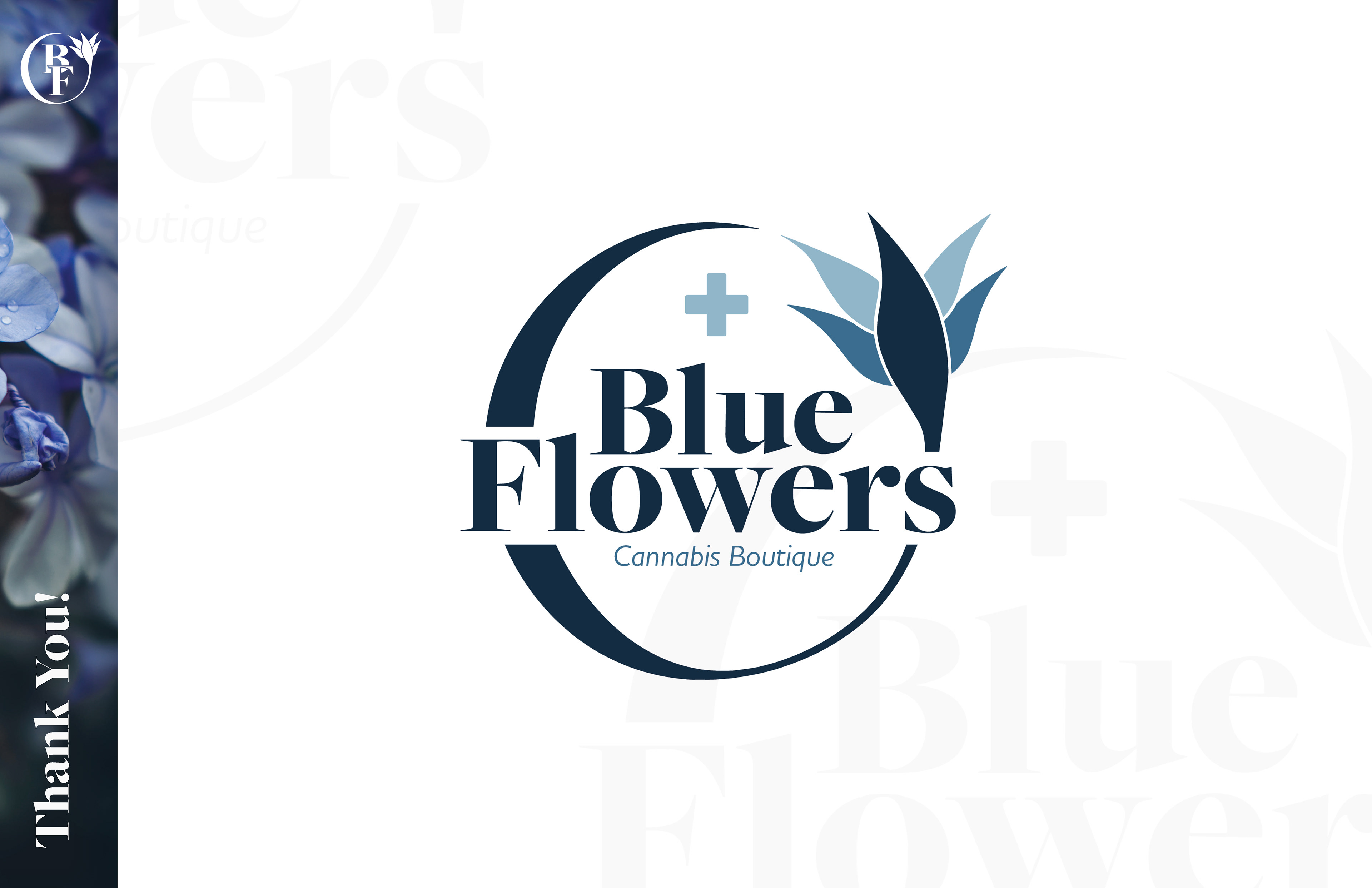
About the Brand
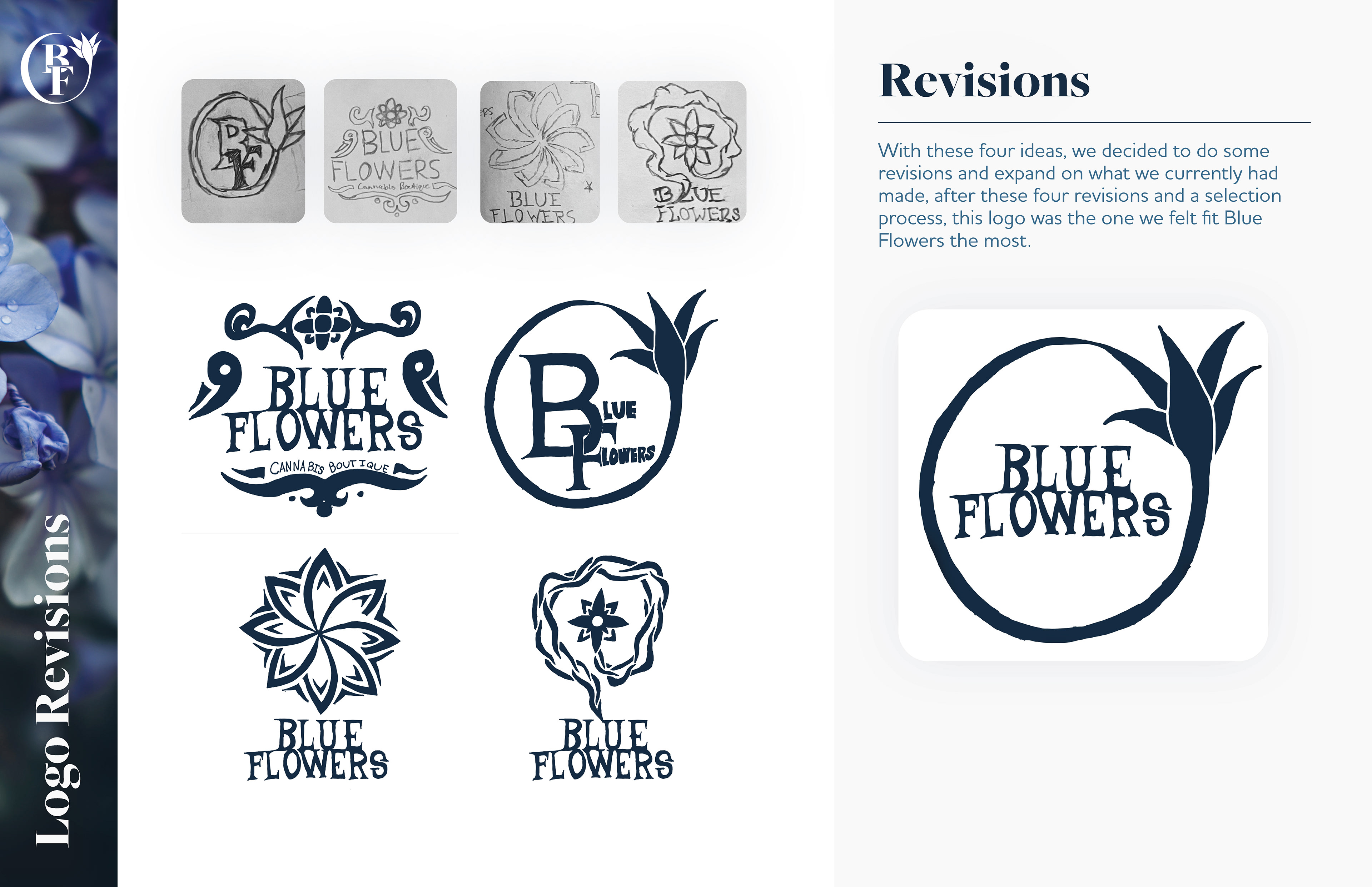
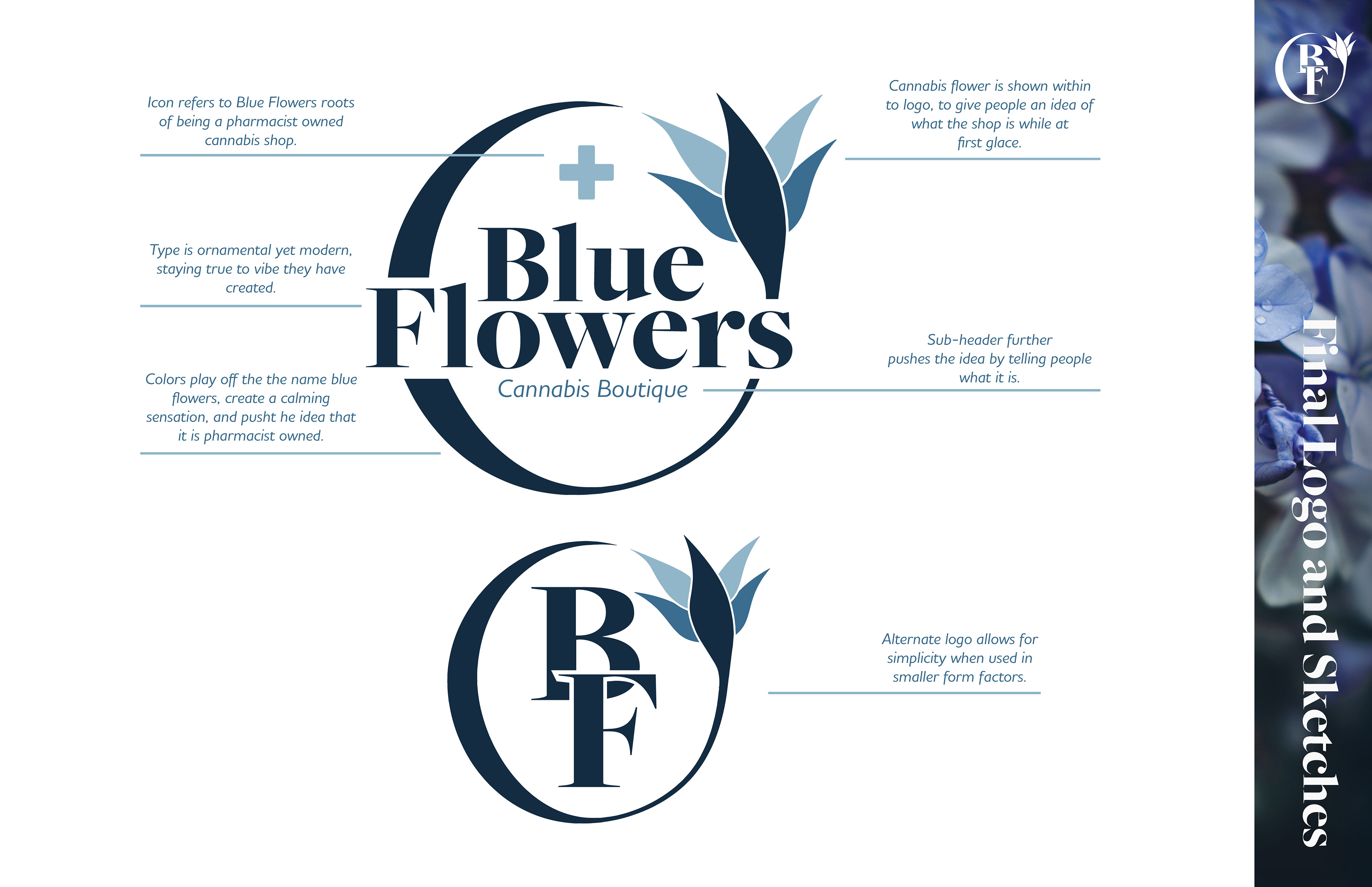
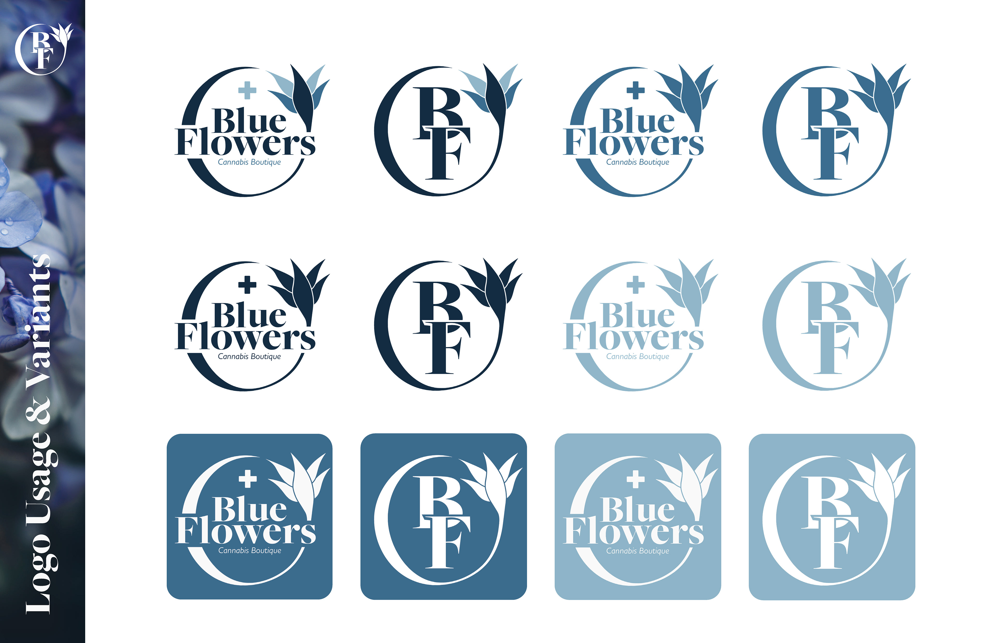
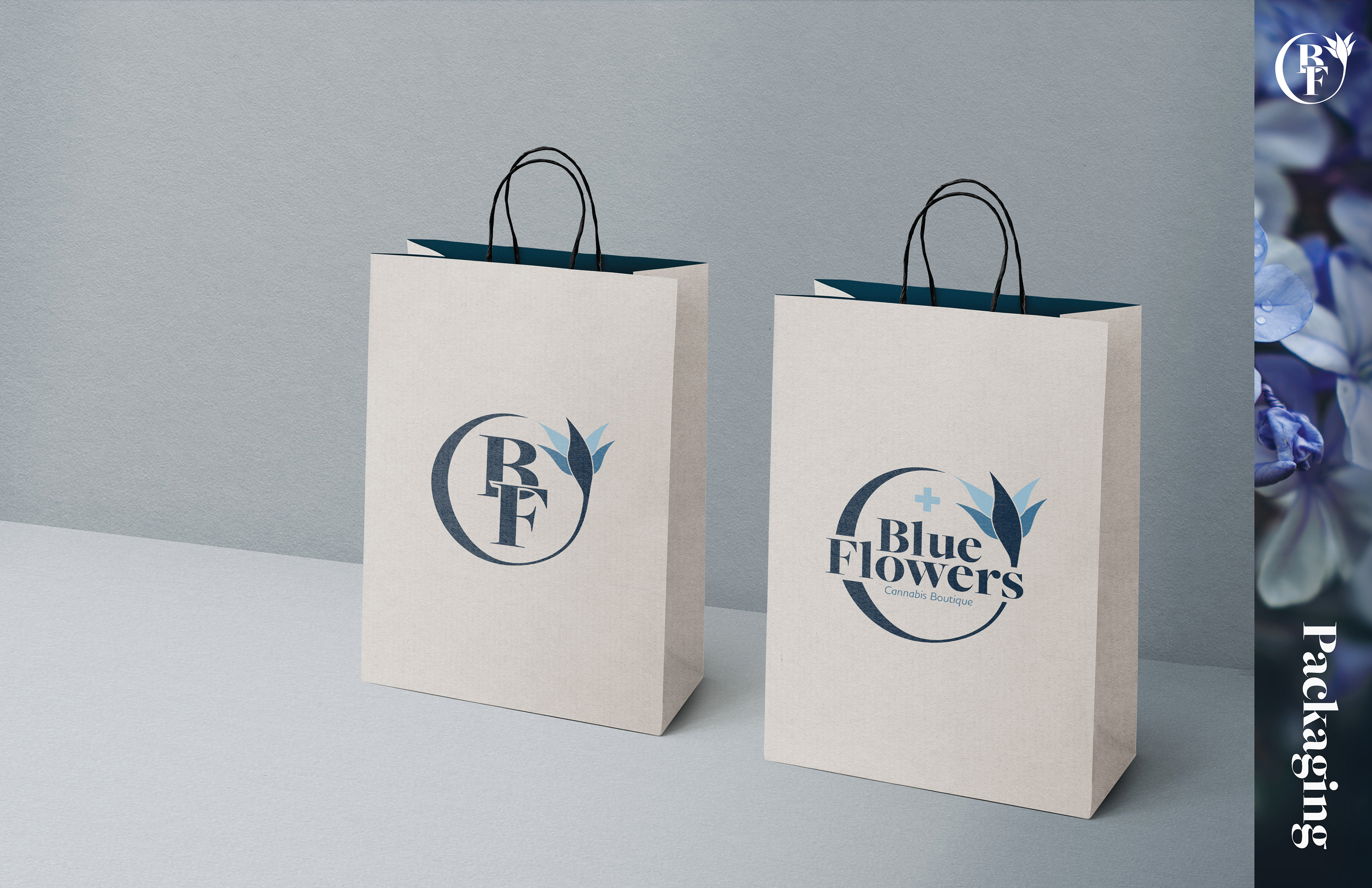
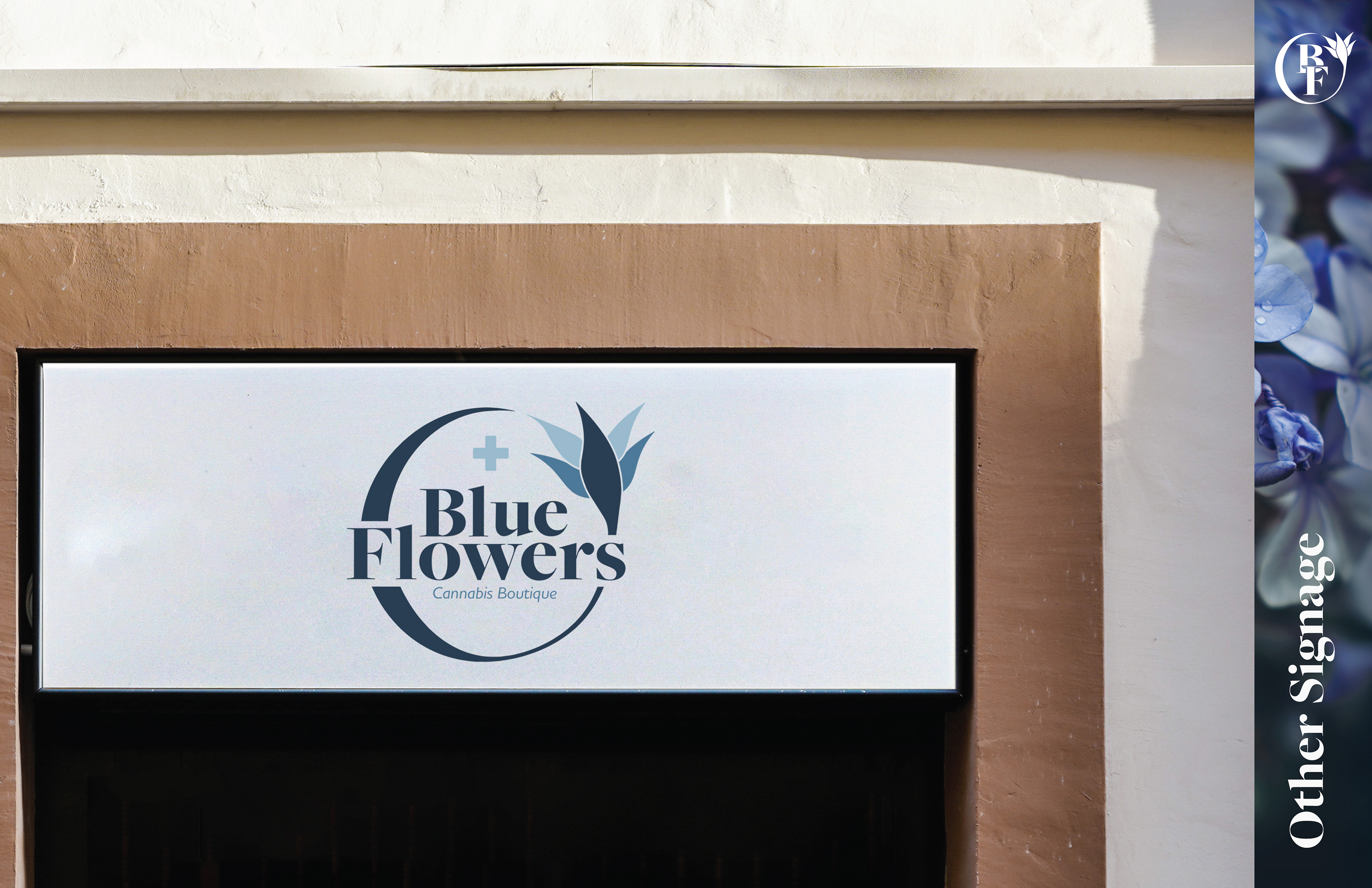
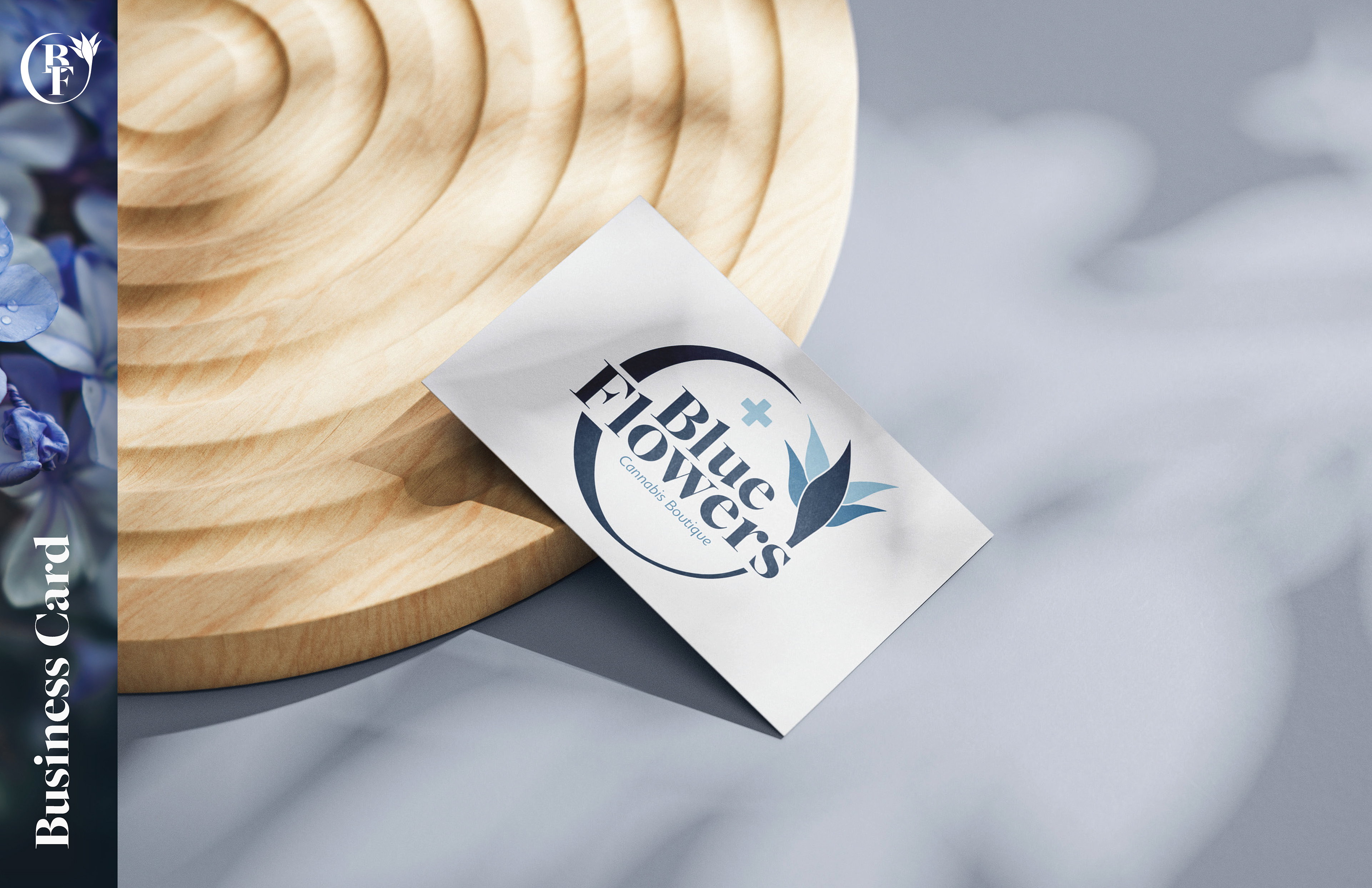
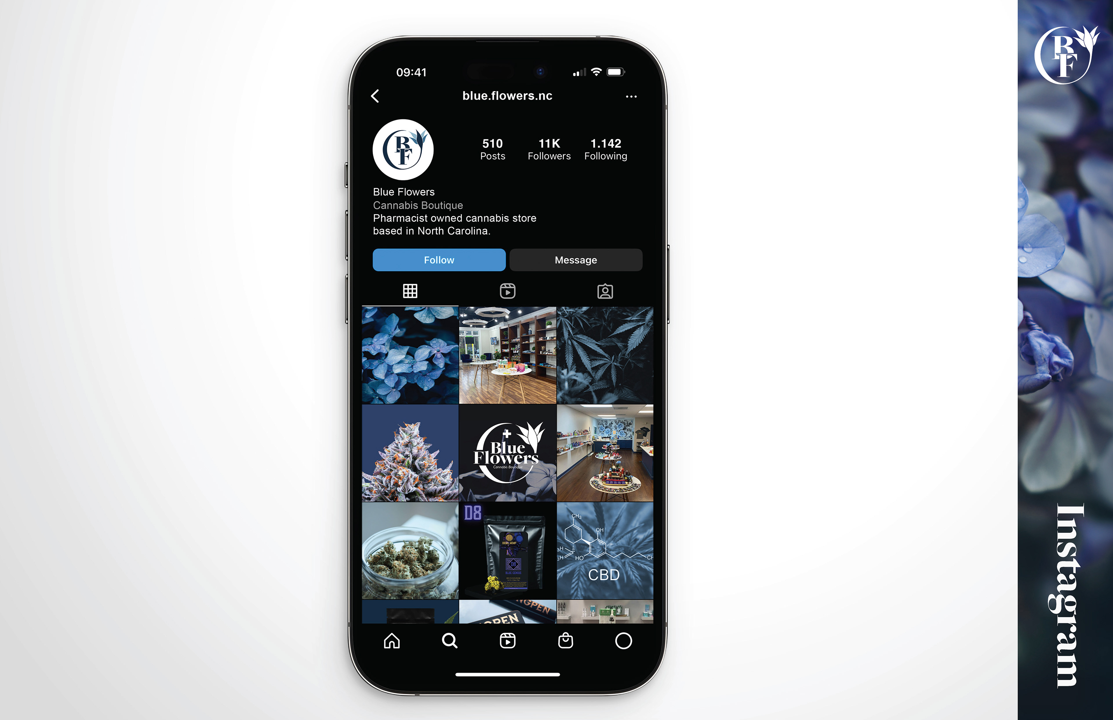
This project was done as a rebranding of Blue Flowers' current branding which had inconsistencies and felt very grandma-like, leaving certain audiences to think it was actually just a flower boutique or something else. To fix this issue we wanted to make the brand available to a wider audience, and the first thing we focused on was the logo. The previous logo was very simple and old style, but with this rebranding we wanted to keep that floral feel while also letting people know cannabis is sold here.
The Assets
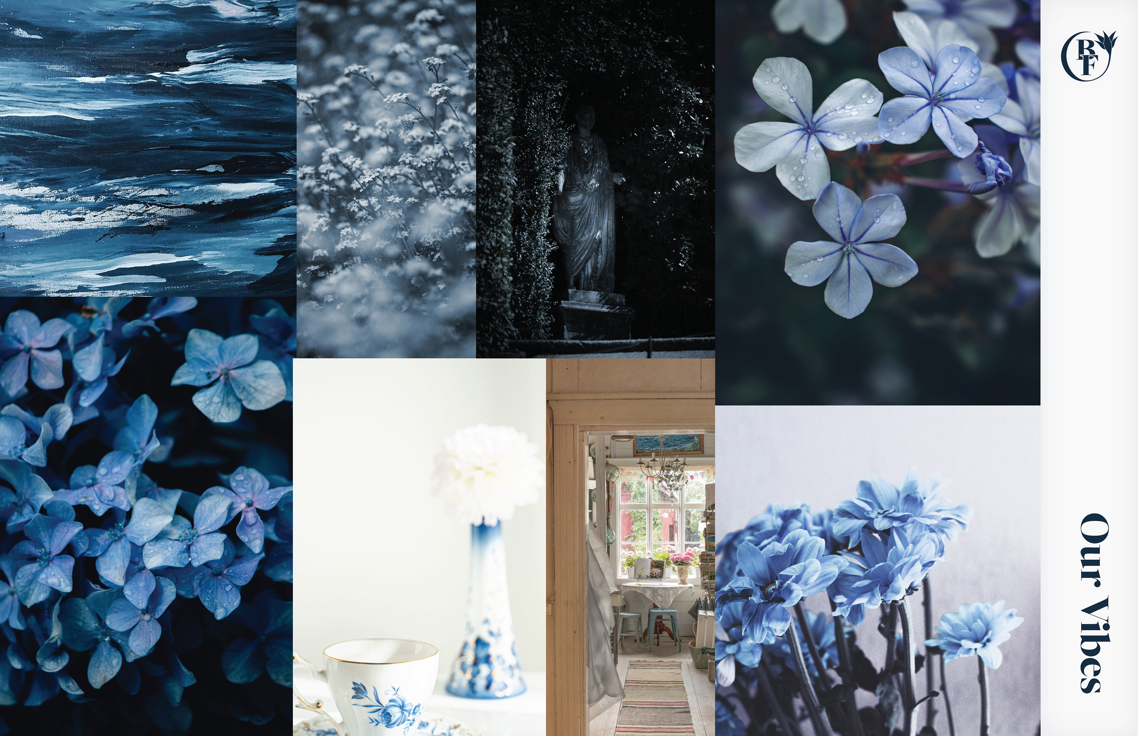
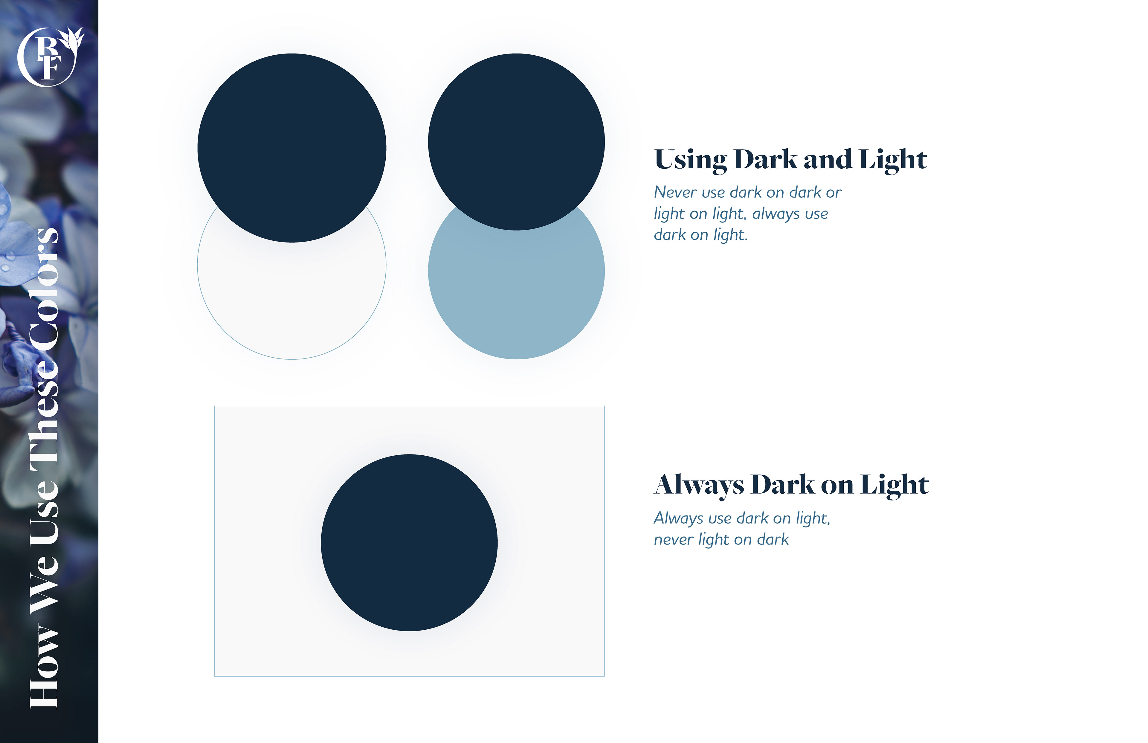
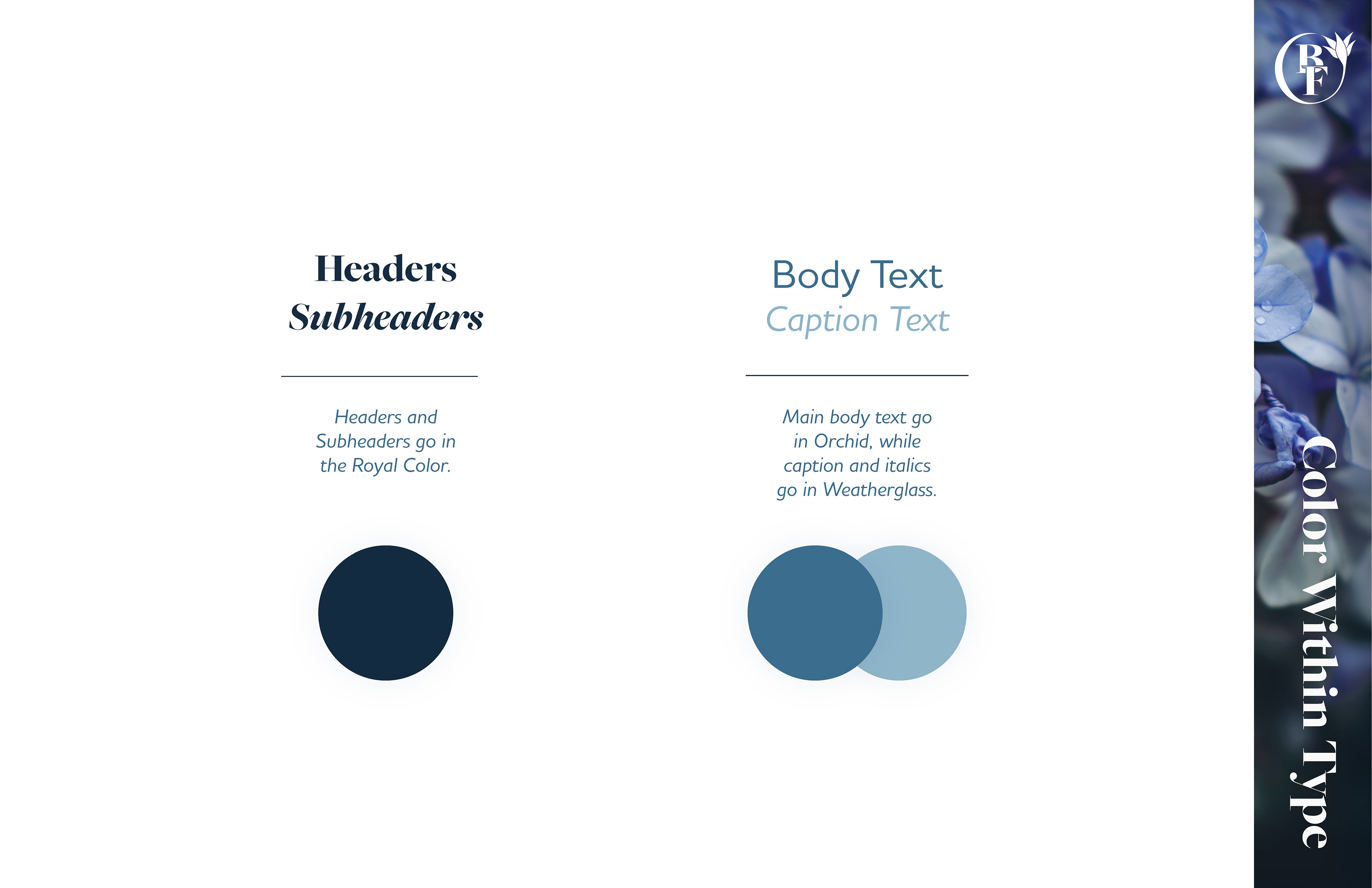
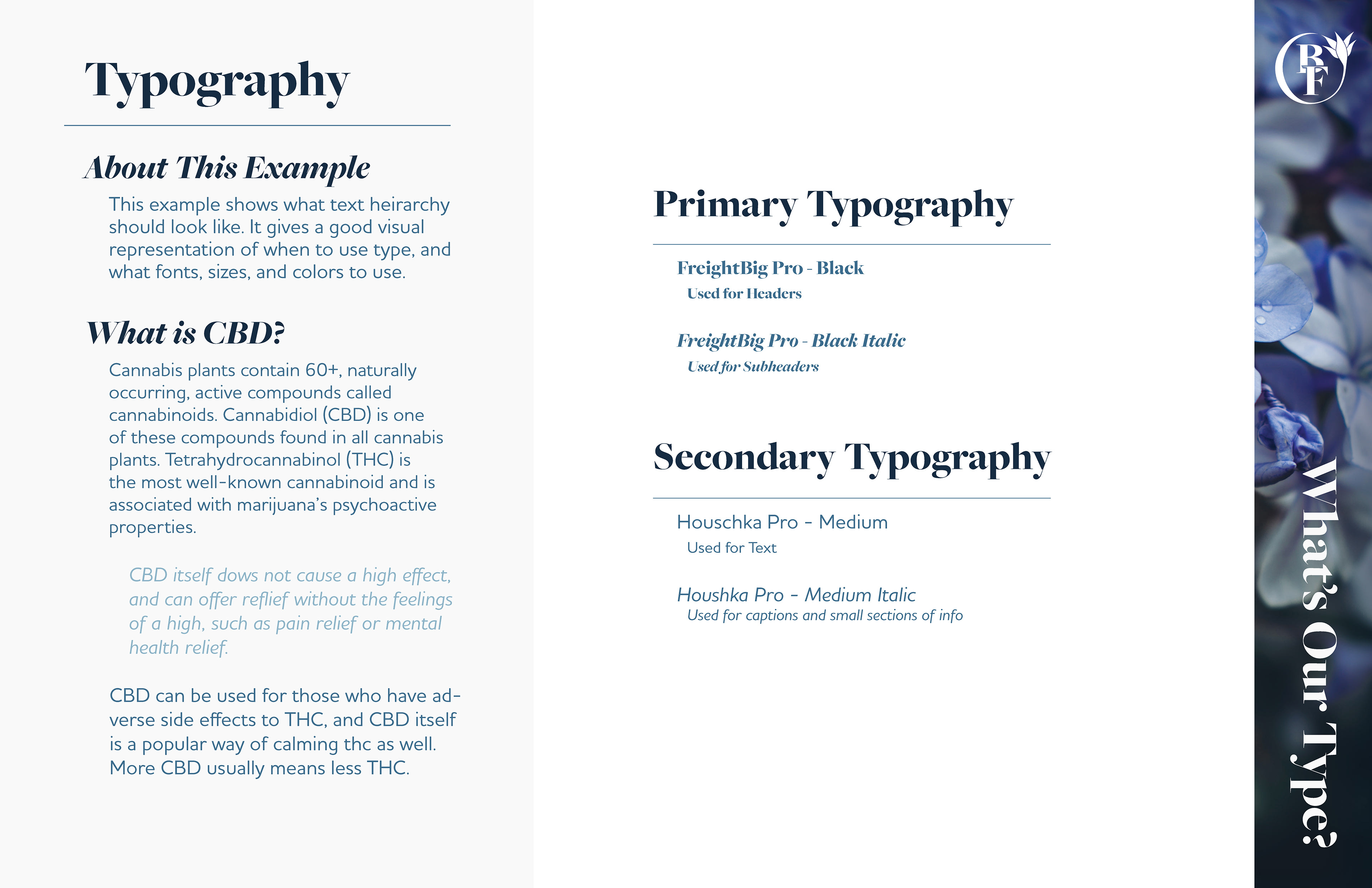
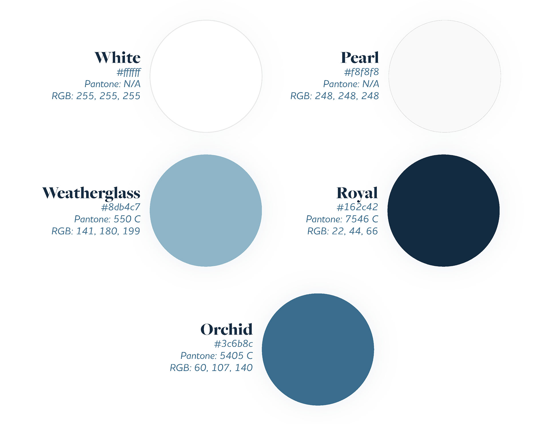
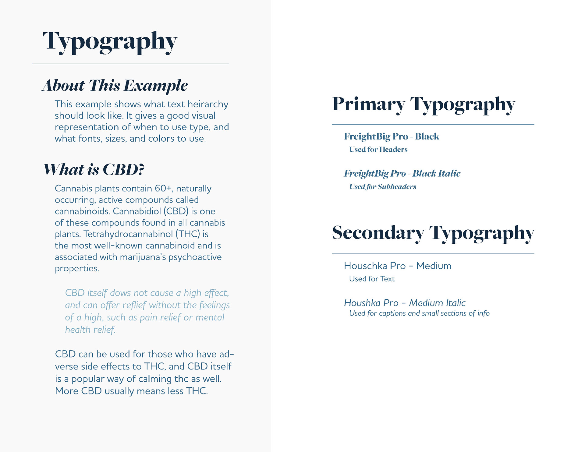
When choosing the colors for the brand, the primary inspiration was the name. Being named Blue Flowers, we wanted to go with a cool toned blue palette against white. This allows for it to lean towards the medical part of the brand but also feel comfortable and calming. The Typography was also chosen with this same idea. With FreightBig Pro for the main type, the brand can keep that old style feel but in a more modern way, especially with Houshka Pro as the secondary font, allowing the brand to reach a wider audience while staying true to it's roots and current feel.
Final Branding Guidelines
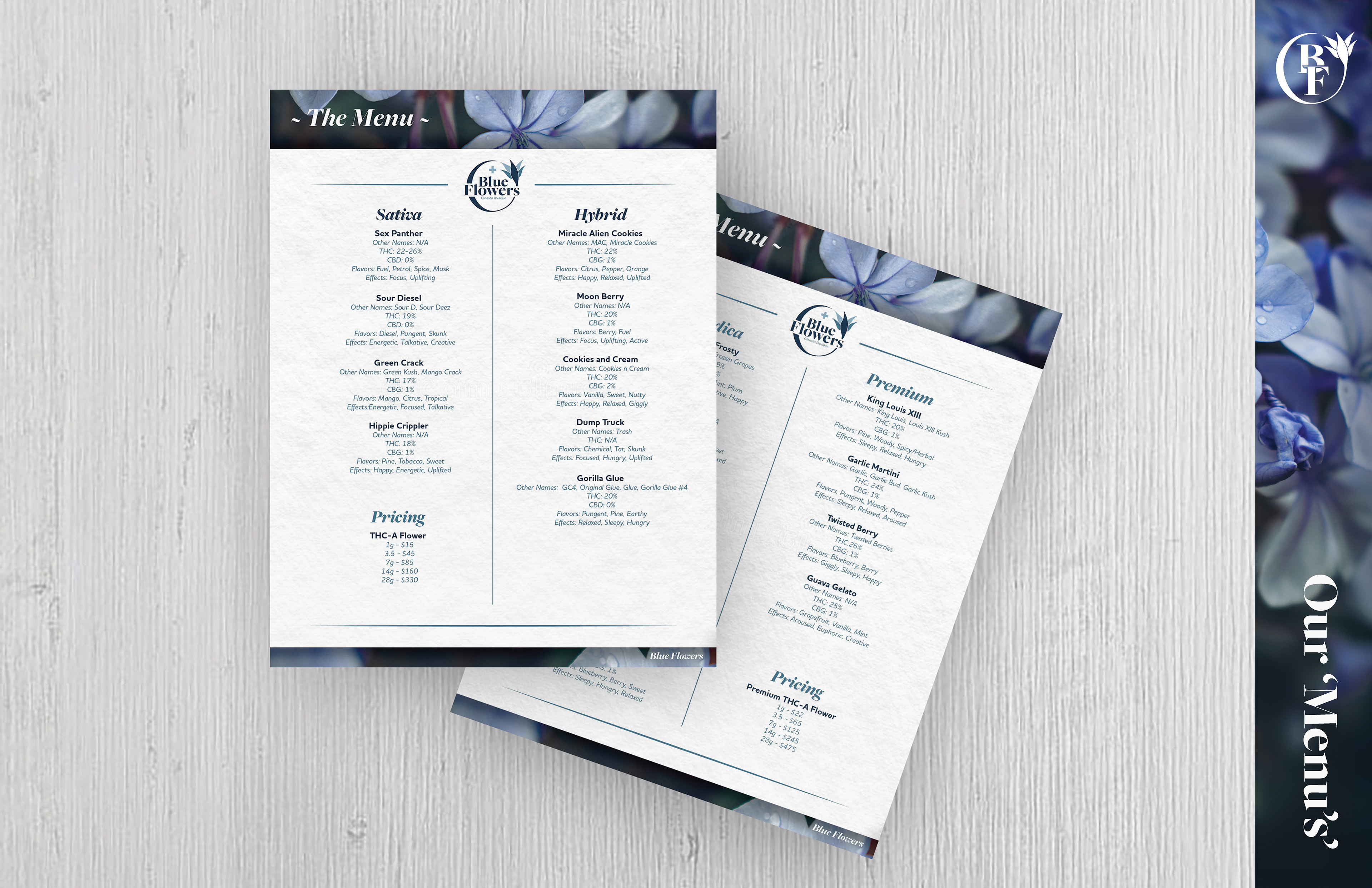
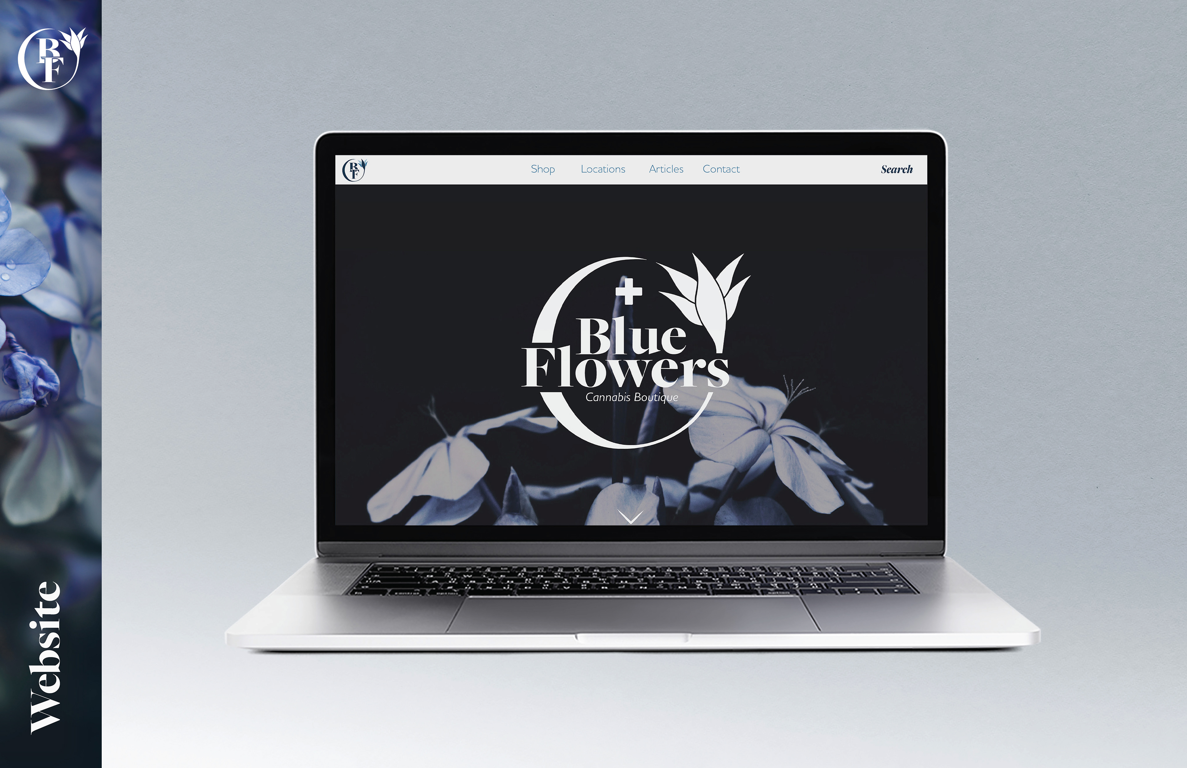
Main Deliverables: Brand Guidelines, Logo, Color Palette, Typography, Mock-Ups
Presented to the client were the final brand guidelines of the brand, showcasing how it is meant to be used and each deliverable within the brand.
